Highest rated logos
Most rated logos – Page 233

Hello there, here is my logo for a brand of t-shirt. Krik Kraké wants to be a registered joyful, funny, dealing with subjects so ironic.


Architecture department at Białystok University of Technology. Description: simple, easy to remember and draw sign. Symbolical reference to steel bridges span, construction, modular grid. Including W&A letters. ("Wydział Architektury" Architecture Department). Symbolical imaging of 3 parts/triangles as 3 faculties: - architecture & town-planning, Interior architecture, Graphic design

Logo design for A Cup Is A Corpse, an advertising campaign that focuses on the environmental impact of using disposable paper coffee cups.

CHINA WEAR FOR EXTREME SPORTS
Fashion House Logo
LED solutions / 2009

Logo for e-sport team from New Zealand.

webarchitecten is a web design studio based in Netherlands.

Design and manufacture of leather accessories (bracelets, watches)
Self-branding logo. My name is Chris Beaumont, Beaumont is french for beautiful mountain. the logo features the tip of a pencil in a clean design with snow on the top to give the impression its a mountain.

A profile of a lion with surrounding space forming an 'L'
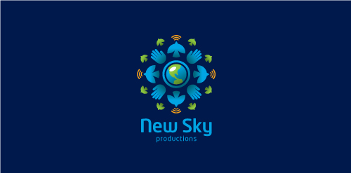
Proposal for New Sky Productions, a passionate, socially responsible company with a global reach based on powerful visual storytelling and compassion through journalism and use a range of multimedia elements to deliver the message.
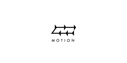
Directional arrows representing motion also form an 'M' in negative space.

Sushi bar
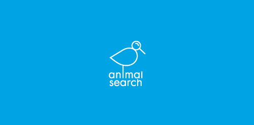
A bird with a magnifying glass for a head representing 'search'.

http://www.rospartner.ru/

computer with the hardware store

custom type www.yaceky.com
my new personal logo

artefakt
Travel bag and accessory distributor.

Reliable Healthcare Solutions provides in-home non-medical services to patients ranging from personal care to nanny services and everything in between. The logo incorporates the home symbol, and the human element of the hand. The home is where their services are administered, and the people are ultimately what make RHS unique.
Identity for Nurses Recruiting Agency, United Recruiting.

Logo design for a law firm company.