Highest rated logos
Most rated logos – Page 200

Travel agency


Logo for a Record label.
Fun logo for sale.
Brand name: Big Papa's - Field: Restaurant Year: 2014 - Location: USA

Designing a unique and bold mark for a student card for university students to receive discounts at food and drink venues. First concept I came up with. They want the 19 in the logo. WIP. Complete project on Behance: https://www.behance.net/gallery/16985931/Nineteen-Card

Finalized concept for a website which lets you manage your health records online along with many other things such as health trackers, health scoring tools, smart cards access to top doctors, and intelligent alerts & reminders. Approved by the client.

eco cosmetics
The Alex House Project is a multifaceted program designed and led by young mothers to increase long term self sufficiency and independence by providing parenting and leadership development in a safe and caring environment.

For a creative consultant agency.

Customizable Ready Made Logo For Sale at http://eisaks.wordpress.com/2014/04/04/futuremo/ http://stocklogos.com/logo/futuremo http://www.brandcrowd.com/logo-design/details/84729
Logo design for a Dutch sport physiotherapy company called 'fysiosportief'. They asked me to come up with a new refreshing logo for their business. The client preferred the type to be custom and as friendly looking, easy to read and a little twist integrated in it that shows some sort of speed and dynamic. The icon is a combination with the letter 'F' together with a running human. Also tried to perfect the balance by adding that same shadow effect from the typo.
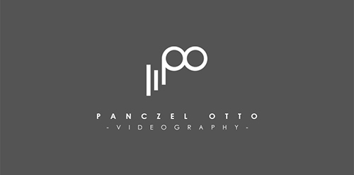
Videography Logo
Webdesign, architectural visualisations, brochure design.
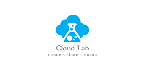
Logo for a cloud based music collaboration app
perfect logo with no limits in use. You can buy it if you want.

Logo design for a self health care platform. The logo mark is to serve as an icon for the mobile app. The logo mark is a fusion of a heart into a stethoscope.

Naming & Logo for motivation to recycling. (Recycle + leaf + relieve).
A simple logo from clear message. An ice cream cone formed by the play button and a reel. Used primarily for agencies working in the cinema. Easily reproducible and scalable without losing the detail.
PROJECT Panax Pharma is Czech based distributor of medicines and pharmaceuticals. I was asked to create simple and distinctive visual identity including logo manual and stationery. CONCEPT The logo contains stylized illustration of medicine mortar - traditional tool used for pharmaceuticals production and processing. The mark is reflecting susceptible and responsive approach of company through subtle rounded stylization and refined execution of it's design. Negative space used in illustration of the mortar also inspires emotions of preservation and processing content from out. Finally Optima typeface with turquoise and silver color palette completes company corporate identity design basics.

A quirky font and soft colours combine to make this childish sweet logo. Perfect for a candy shop!
A simple and effective logo, a seahorse shown in an unusual way.
Maravilla (wonder, beauty) is a logo of class and simplicity. Suitable for restaurants, B & B, sites used for events. The lines,simple and soft, make it recognizable even if scaled to a small size.
Inspiration came from a gramophone. Designed for companies that handle books, libraries and events that promote the dissemination of culture.

Naming & logo with connected basic forms, but liquid like ink.