Highest rated logos
Highest rated logos – Page 97
Logo for company involved in architectural design


Icon for Elle & Elle A Health Spa for women.
Symbol paradigm change! Logo combining the two most powerful ancient symbols there is. Yin & Yang and Flower of Life. In this case it needed to be the basic form of Flower of Life, the Seed of Life, to have the form nicely integrated as one. This logo is for a Feng Shui consultant that asked specifically for the energy of both symbols. The logo is copyrighted. The feminine fuschia color combines the universal loving energy of pink with calming blue, making the logo strong, passionate and confident. Some orange was added to give it an extra energy boost, to add depth and more symbolism.
Logo for the IV International Conference organized by the Istituto Zooprofilattico Sperimentale dell'Abruzzo e del Molise

Logo for the fashion house.

A logo design for data company "TIER".
Re-Branding ROXO. Branding agency: www.bratus.co

During the holidays I had an idea to draw a lion symbol. I tried not to complicate the shapes, the result went better after so many attempts.

"The Rabbit Hole" is an night club.
Logo for web developer.
Logo show spider web. My client is building web, as spider is building his spider web. He is also ready to work, you can email him at: kamil.habrzyk@gmail.com
Ready to work - pkowal98@gmail.com

logo for Odnowa fotograficzna
The logo of our website which features a negative space resembling the two letter MW.

in this logo I tried to create an unique logo through squares move upward to representing growth with the colors : green,grey,white .

Event agency. Organization of parties

Owls fanclub

New work is here! Branding and packaging design for a Swiss cosmetic line-up. Check full case study in my portfolio. www.dominikpacholczyk.com
Simplicate

Confectionery сompany

ONEYE MAN is fresh modern dynamic brand with short easy memorable name. It will suite well to any business or industry

Street brand with no limits in use. For sale.
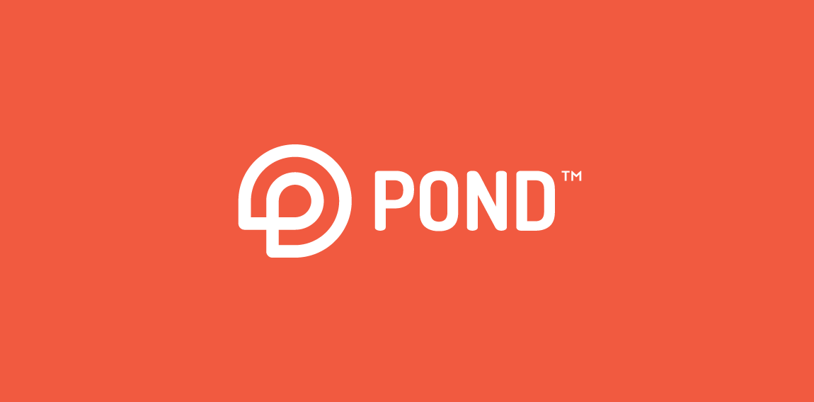
Logo design made for new dating site/app. Mark is a combination of "P" letter with simplified shape of water lily (very characteristic part of pond). • • • follow us on www.instagram.com/triptic.pl

Based in Albany, NY & Washington DC, Solomon Law Firm represents federal employees.

Snijders is a technical wholesaler in hydraulic hoses and accessories from The Netherlands. Their products cover all conceivable connection parts for hydraulic and pneumatic components.