
Highest rated logos
Highest rated logos · Page 96

Restyling of the logo for shop of design sunglasses (for hipsters). www.lookatsun.ru


Logo for a stationary and art and office supplies producer.

Logo designed for a Mens Formal Wear Brand

Logo for bio energy forum. Represents air & leaf in the e.

OmniQuest Living Logo
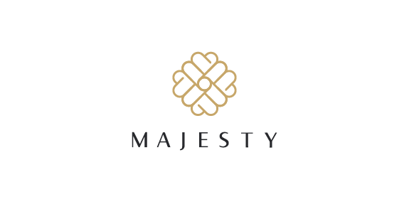
The basic shape of the logo is based on three elements which are, a letter M, a crown and a heart expressing majesty and deep love of chocolate, gold and black are the perfect combo referring to a luxurious palette, Finally the font is a sans serif humanistic with elegant curves, superfine and bold lines showing the contrast and beauty of a high quality, classic, sophisticated product.

logo for Polish Space agency. Several concept combining Poland (as a country shape), rocket/space shipt and orbit.

C Monogram

Emblem for indoor soccer team Callippus. The shield forms a letter "C" and "11 (Year of Establishment) The tiger represents our playstyle of rapidity, technique and slyness.

logo for Odnowa fotograficzna

A hosting company which locate in USA. Using the number of “8″ to be the letter of “g”.

Logo for interactive agency
For more: https://www.behance.net/LucasCassim

Logo for interior designer


Just for fun

Bobry is a dynamic, high-powered computer guru. A while ago he asked me to image his personal beaver logo.

www.lukaszjackiewicz.pl

Milkolino is fresh milk for children.
Logo for the manufacturer scrapers for cats.

Icon for Elle & Elle A Health Spa for women.

halo, http://www.youtube.com/watch?v=QwOU3bnuU0k&ob=av3e

Victoria is a financial fund based in Warsaw. The key was to combine a eagle (symbol of Poland) and V letter (for Victoria). There were several concepts - some modern, some classic, more decorative with a pinch of victorian styling.
Radio7