Highest rated logos
Highest rated logos – Page 93

Kedi Identity http://www.behance.net/gallery/Kedi/5498877


ARGEFON | IDENTITY IT & COMMUNICATION SYSTEMS http://www.behance.net/gallery/ARGEFON-IDENTITY/7640631
Logo idea rejected by client. It is an unused proposal for a media-related company and now it's for sale.

transportation company
Logo design for website offering e-books, audiobooks and movie adaptations of school books. Basically the idea was to combine classic books into something more digital. Then came the idea of combining open book and screen.
Symbol paradigm change! Logo combining the two most powerful ancient symbols there is. Yin & Yang and Flower of Life. In this case it needed to be the basic form of Flower of Life, the Seed of Life, to have the form nicely integrated as one. This logo is for a Feng Shui consultant that asked specifically for the energy of both symbols. The logo is copyrighted. The feminine fuschia color combines the universal loving energy of pink with calming blue, making the logo strong, passionate and confident. Some orange was added to give it an extra energy boost, to add depth and more symbolism.

This is my branding logo for my design laboratory.

Combination of rat with carrot
Logo for music portal

Avilyz is a Dutch consultancy agency specializing in arbitration services and means beehive in Lithuanian. The arrows from the mark represents the diffent directions and services. The white space that appears inside the arrows form a hive.

Air Conditioning
Modern Fossil is a blog covering and celebrating underground contemporary visual culture.

Logo for the center mountain tourism.

Logo for bakery

During the holidays I had an idea to draw a lion symbol. I tried not to complicate the shapes, the result went better after so many attempts.

Logo for a discussion platform.

Logo for a store of agriculture and pet shop.
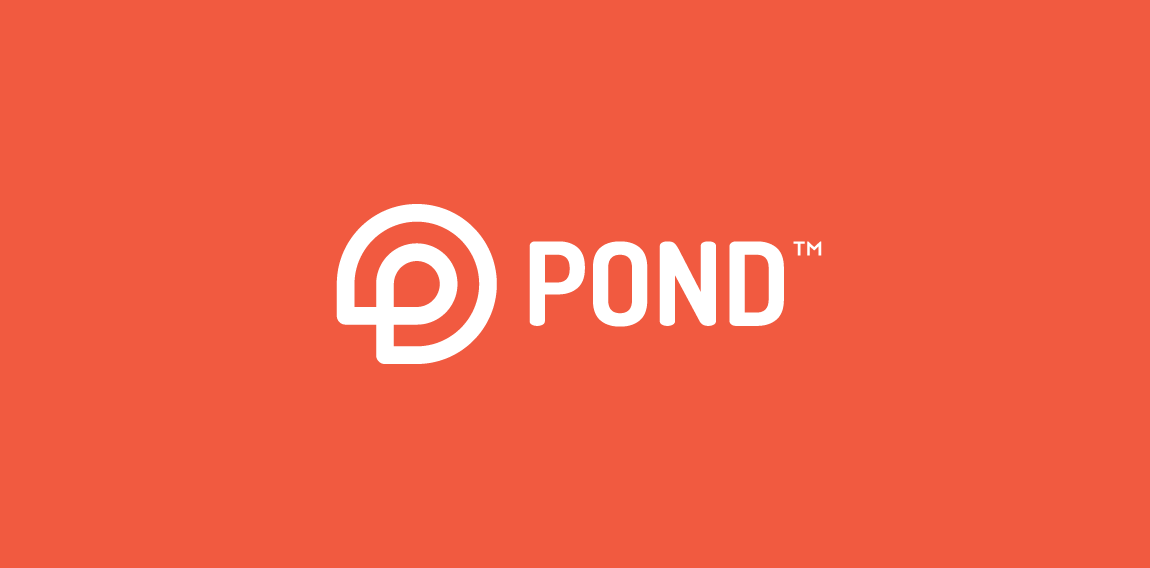
Logo design made for new dating site/app. Mark is a combination of "P" letter with simplified shape of water lily (very characteristic part of pond). • • • follow us on www.instagram.com/triptic.pl
Consulting & investor services for internet startups

Exclusive Customizable Logo at http://wp.me/s4571j-focuslab

Exclusive Customizable Logo at Eisaks Logo Design.

Logo for my pub. Based on https://www.logomoose.com/logo-design/indi/ It means «mug (or pint) of peace» =) Like a peace pipe (calumet).