
Highest rated logos
Highest rated logos · Page 48

Logo represents two swans forming a heart shape. In the background is the lotus flower is a symbol of purity.


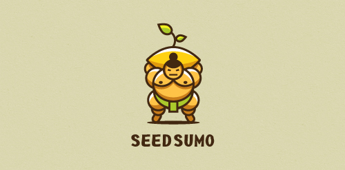
"We are a mentorship-driven seed accelerator. We look at hundreds of Startups a year and only choose 10 that we give $20,000 in funding (seed) drown them with mentors and advice and prepare them to pitch their startup to dozens of investors to take them to the big leagues (sumo). " Unused proposal

Based in Denver, Colorado, Tenacious Landscaping is involved in projects ranging from town to country gardens, and uses both traditional and contemporary styles. Our design work for the Tenacious Landscaping brand coincided with a revised content and monetisation strategy. So we chose the wild beauty of the bighorn sheep, the State animal of Colorado for this vibrant company’s brand identity. Boasting horns that can weigh up to 14kg and an intrinsic part of Native American mythology, this animal captures the spirit of Colorado wildlife and reflects Tenacious Landscaping’s brand values of power and elegance.

First class brand. For sale.
Warhol Nightclub logo proposal.

....

logo idea with king
The Ocean Palace Luxury Resort logo features a minimal black and white color palette to keep the focus on its intricate symbol, which bears a crown in the middle to imply luxury.
A rebrand of logo for a local vintage/hi-end furniture producer. The logo contains symbolic od "saw/teeth" and looks a bit luxurious also if you imagine the logo on the actual products. Which makes the brand and it´s product very special and original.

a logo made for a it technology company from Poland - unused concept.
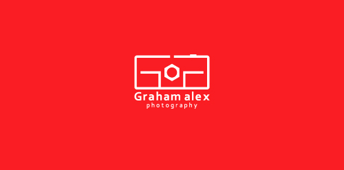
Graham Alex is a photographer and has recently opened his studio in Birmingham. He named his studio Graham Alex Photography. They hired me for branding their business. They want an identity that is creative and will be relative to their industry. I present four identity design concepts, they like the following one. In this logo camera represents, “photography” and GA are initials of” Graham Alex”. Camera and initials are merged to form a creative unique identity.

Submission for a contest.

Exclusive Customizable Logo at Eisaks Logo Design.

One of my logo designs that I made for fun.

Rejected logo for a promotion agency by that name
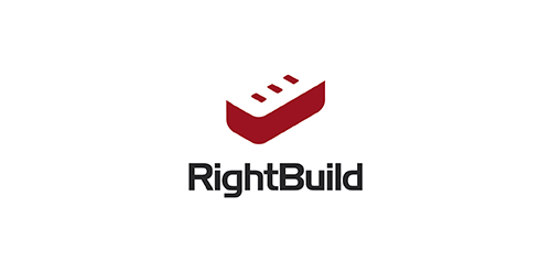
Clean and simple logo showing a tick/ check mark and building brick. For sale.
Freelance Graphic Design Logo

For this logotype design, I had to deal with an a 14 years Yoga studio, called "Anima Soma" and refresh its appearance and Brand identity. After a lot of study on Yoga field and practice books, the source of inspiration for the logotype design was the classic yoga position and the Zen Stones. Design by Vasilis Magoulas / VAMADESIGN.COM

Logo design for the company "Bukdruk" dealing with short-run printing of books. Company wanted to create a symbol based on a book and a tree.

We are building an online travel experience and brand focused on socially responsible travel. We are teaming up with international experts, government agencies, nonprofits, small businesses and communities to revolutionize how people plan and experience their trips. We are young, hip and forward-thinking with our finger to the pulse of pop culture. "Vaya" is the command "go!" in Spanish. "Vayable" is pronounced like "viable," which means capable of living, growing and developing adequately. To connect people through travel for the sake of creating happier, more authentic and sustainable experiences for travelers and the communities they visit. honesty, ingenuity, authenticity, adventure, compassion, ambition, edgy, cooperation, optimism, efficiency, wisdom Using the negative space to combine two concept which are the Google pin and the concept of logo(Vayable). Take the trip, change the world.

An emblem designed for company offers custom printed t-shirts. Tie/pen/ruler ambiguously refers to expert/engineer/specialist. • • • See full view at https://www.behance.net/gallery/28707217/ShirtExpert • • • Follow us on www.instagram.com/triptic.pl

Logo for Polargram
The same company as "Entrepreneur Express". Offering marketing mentoring. "Discover the power of Mastering the Secrets of Marketing to Improve and Grow your own Business" www.mastermarketing.co.uk