Highest rated logos
Highest rated logos – Page 41
Logo para triciclo infantil (de brinquedo) Logo for children's tricycle (toy)


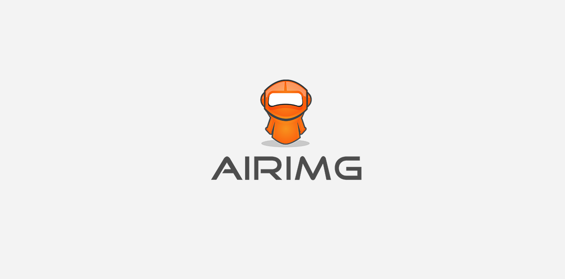
this logo for tech company called "airimg" , I created a modern robot mascot as spokesperson to represents airimg with with bright colors .

Premies parents support group
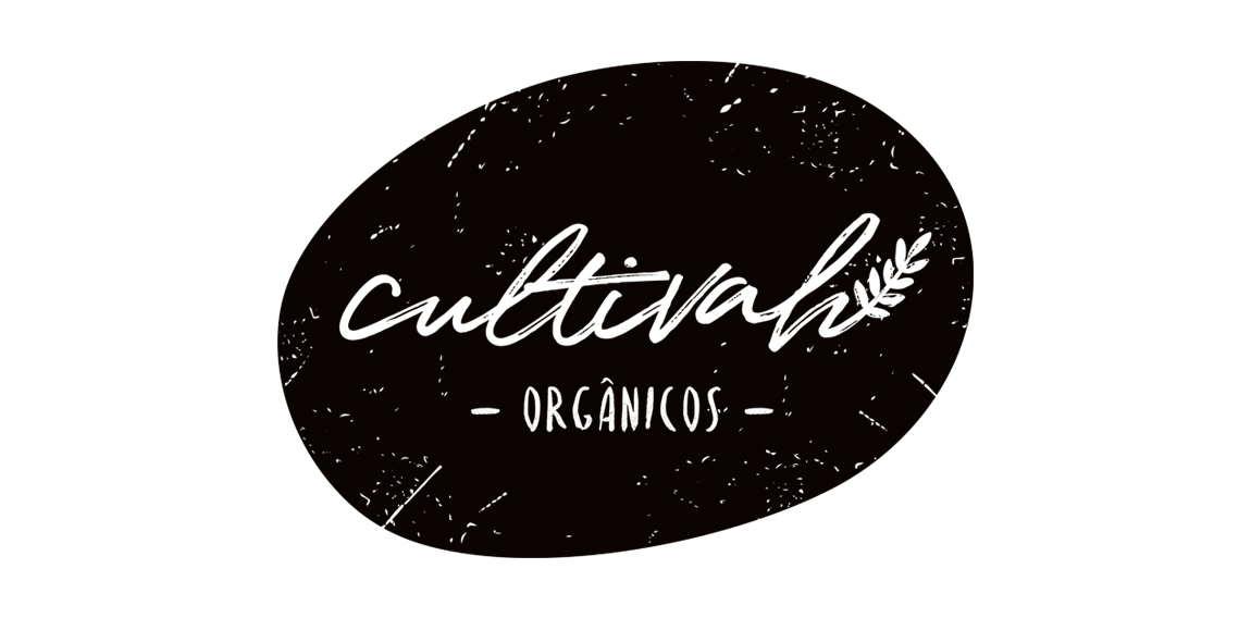
The lettering constructed irregularly, as if it had been drawn by hand, expresses the organic aesthetics of Cultivah. The branch, which extends throughout the lettering, as if it had germinated, contemplates the main product of the company, the one of vegetal origin. Finally, the noises present throughout the brand, its imperfections, illustrate the in natura language of business, free from external agents and conceived in its purest form.

Logo for a Product Packaging Company..
Hedge Fund Logo

logo for a consultancy, meaning a part of the network, as well the logo is having some free mason symbols

Brand story: Driving classes for old drivers!

The North Coast Classic Sports Car Club is a group of vintage sports car (pre-1976) enthusiasts who have annual car shows, tours, and meets in the northern most region of California on the redwood coast.

soccer crest design
AmourDuDragon Logo

Guillotine concept typo

The Motor City Chop Shop logo features a flowing action, created with curved letters, lines and shapes. All of these elements combined create a raw, compelling feeling of a chopper in motion.

Concept art

Foxography

logo for mobile phone operator

www.cxdesign.lt

Dukat - luxury gold jewellery

dream high

Gryphon Media Group logo
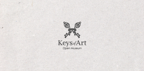
In the designer's words: An elegant logo infused with meaning. Functional both in the color version and in the version in black and white. Designed for galleries and museums open to all forms of art / Ideal for these industries: Art & Photography, Events, Design & Creative Services.

logo for a local hotel based in mexico.

Power sources - logo for the psychologist who's main focus is sources of woman strength.

HAWK is fresh modern dynamic brand with short easy memorable name. It will suite well to any business or industry.