
Highest rated logos
Highest rated logos · Page 39

logo for a dermatology clinic based in mexico.


logo for a corporate presents company based in mexico.
Unused proposal.

cat logotype

My personal brand.

Logo for a Jazz Club

Regiobloemist.nl delivers flowers in any place in the Netherlands. The logo can be viewed at www.regiobloemist.nl

Clean and colorful Hummingbird logo design. For sale.

Logo for the cosmetic company.

Logo for a Dutch wijn forum called Experts in Wijn where people talk about wine: Experts in Wijn

Sunny Wines is a small wine importer from Warsaw/Poland. The aim was to combine letters SW with wine symbols like grapes or cork screw, but the client wanted to see also more elegant symbol combining those letters.

Bulgarian Stock Company

The Shopping Online Logo

The Thailand's automotive parts manufacturer (CNC)
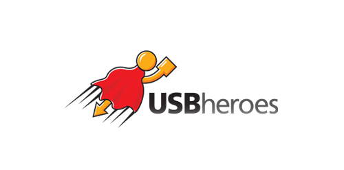
Here is USB superhero!
This is just my idea which came into life at last.
Logo is perfect for any kind of business related to USB devices,flash drives etc.
New logo for Webkolm web-agency. Webkolm is an Italian Web Agency based in Trentino. They develop website and other web stuff "into the wild". The agency is formed by three people: an UX Designer a Crazy Programmer and an Social Media Manager & SEO Specialist. Three different mind with different skills one identity. The old logo rapresent a "UI arrow" shaped like pine. The new logo mantain this elements but in a modern way thank to the "Impossible triangle structure" ispired to Escher works. The font is "The Sans" with a semi-serif that caracterize the K word.

Parrot multicolor


Incubare is the latin word of incubation which means sitting on or brooding bird's eggs in order to hatch them and that's what is represented by the logo: a nest, eggs and a bird.Ideal for a maternity.

naming and logo created for a mobile device app.

Fish Club logo

CST is a training company. Symbolism of a chess knight is central to CSTs strategy. It exemplifies dynamism and initiative. Basing on these qualities and the target group in part the automotive branch I have referred in the lettering and composition to the aesthetics of sport cars emblems. Over the course of many sketches, I have created a convincing, minimalistic silhouette. Rendered as negative space against a chess square, it creates a bold, cohesive and legible mark.
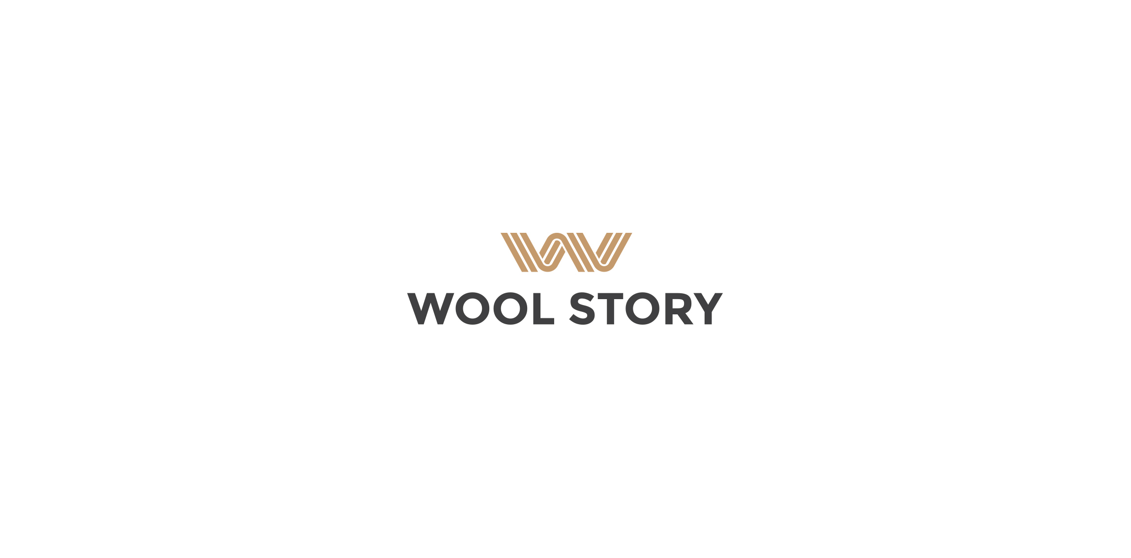
Polish company offering high quality, handmade wool products.