
Highest rated logos
Highest rated logos · Page 41
This logo successfully represents this land developing and civil engineering firm as a contemporary business with their eye on the future. The mark is inspired by a standard target tool used in their industries. Because the majority of W+A’s clients are from within these industries, this provides an excellent communication. The negative space from within the typography creates the “+” in the name, but also serves as a crosshair, as seen in the tools of their trade.


Dukat - luxury gold jewellery

As a new media relations agency specialized in TV and radio, Médiatiser.tv has a very peculiar approach: rigorous, but nevertheless really fun! Brand Brothers played with this approach and created the visual identity of the agency and a graphic universe around a lovable mascot: a crazy, television-headed octopus ... which comes to life online!

..
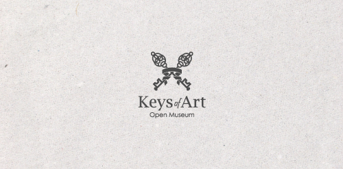
In the designer's words: An elegant logo infused with meaning. Functional both in the color version and in the version in black and white. Designed for galleries and museums open to all forms of art / Ideal for these industries: Art & Photography, Events, Design & Creative Services.

logo for a roselle flower and chia seed beverage.
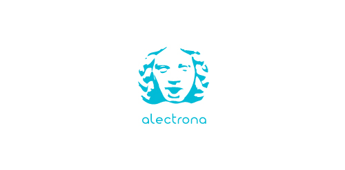
ALECTRONA is fresh modern dynamic brand with short easy memorable name. It will suite well to any business or industry.
Transport logo design by Art Fox Studio
Follow me on:
Website: www.artfoxstudio.com
Behance: behance.net/ArtFoxStudio
Facebook: facebook.com/ArtfoxStudio
My personal logo
Unused logo proposal for ux / ui designer Alvin Thong

Brand for any kind of studio with a lot of creativity. A funny way to approach the job.
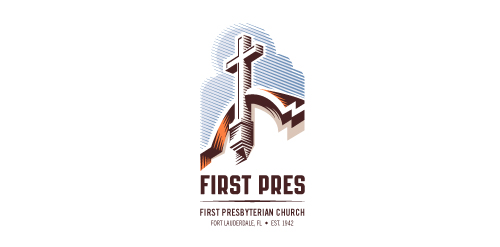
Redesign of the church's old logo in a stylized, illustrative manner, making it more welcoming, contemporary, friendly, casual, & upbeat. Client specified a rendering of the church’s architectural arch and cross in the perspective in this photo, and required an emphasis on the church's nickname, “First Pres."
Here, crisp, exacting vectors emphasize the architectural soundness of the church — a metaphor for the concept of faith as the solid foundation in one's life. This design makes use of hatching to add gradient dimensionality, enabling it to easily reduce down to 1-color. Colors are indicative of the building itself, including terracotta roof. Check my Flickr case study or Dribbble for more images, detail, and full design rationale.
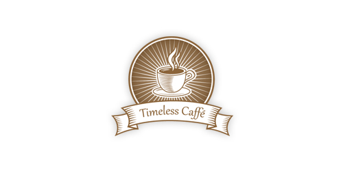
A perfect emblem for any retro/vintage caffe.

Ludlow Ventures
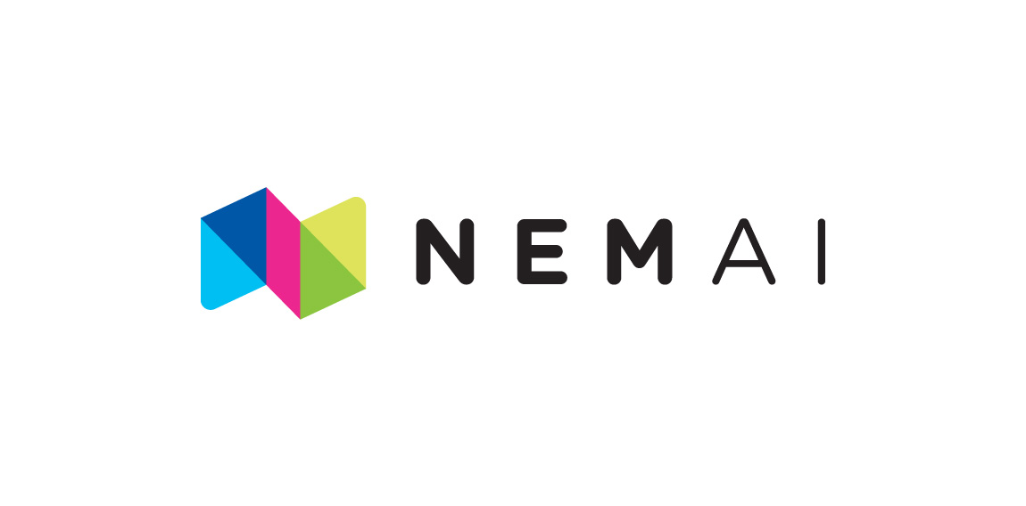
Brand Identity for Danish Ai&Machine learning startup NemAi (EasyAi). Logo is constructed as a monogram (n) and acronym (NAI)

Shoes online shop

logo for a consultancy, meaning a part of the network, as well the logo is having some free mason symbols

... offers best-selling children books via a mobile phone/tablet. Unused proposal.

Logo for downtown bistro.

Tea company logo.
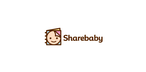
Sharebaby is a social media web site currently in development where you share information and photos all about your baby.
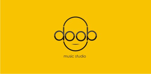
logo for music studio

https://www.behance.net/gallery/14252973/Dra-Natalia-Scuracchio «This project was carried out for Dr. Natalia Scuracchio, a young professional specialized in dentistry. «It was the realization of corporate image accompanied by commercial stationery»