Highest rated logos
Highest rated logos – Page 323
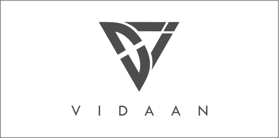
V I D A A N characters to be in the logo symbol and display the charactor of all of them uniquely. Alongside, we also wanted to have one important aspect of our attitude to reflect in the logo, a fast growing attitude! A fast growing attitude, we would like to provide our esteemed cusomters and also derive for ourselves. And to reflect the same, an upward and forward direction ARROW came much close to our imagination and rational thinking. Hence after a lot of time and creation. we came up with this logo.


Company stores for supplies gifts and souvenirs, aims to provide the best solutions to choose a gift appropriate for different occasions .. is seeking to achieve satisfaction to all its customers through its services in helping them to find the gift meaningful, large property that memorable.

Chain logo foro a bicycle store! Feedback and support appreciated!
Architectural studio based in Brooklyn, NY - primary logo


Logo design for professional wedding photography company capturing creative wedding photos.

Done for fun

Logo of the wedding photographer

A logo for a landscaping company.

Audit specializes in implantable hearing solutions.

Abstract conceptual logo showing the two hemispheres of the brain and a gear shift.

a fast project - very economical - for a company, portal giving a functionality to give quck donations.
Touristic promotion of Lake Maggiore and Lake of Como (Italy)

This is a logo design I did for Half Moon Distributors.
The School of Thought is a free online education platform that provides courses, apps, games and content to teach creative and critical thinking skills. The purpose of The School of Thought is to help us question all schools of thought; and to teach the next generation how to think, rather than what to think. It aims to do this by plugging academia directly into the best of the creative industries, bypassing the bureaucracy of the education system to create genuinely engaging and effective learning resources that any student or teacher can access for free. The structure of the platform will be modular, contextual, and multi-faceted, and so the brand identity needed to act as more than just a logo - it needed to act as integrated part of the functionality of the platform and how it is used.

A good looking & tasty brand for your new cheese & other dairy products store! :)

Uprow

Design studio
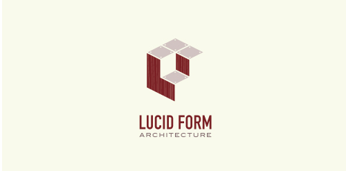
This logo is for a completely fictitious architecture studio called Lucid Form Architecture.
The icon is based on an optical illusion of a cube within a cube. Primarily, the form depicts a big cube, made of wood walls and metal-plated top surfaces, with a notch cut out of the center, resulting in a 3-D "L" shape. However, the longer one looks at this, perception begins to shift, resulting in a couple of different interpretations: 1) a small cube with a wooden wall and metal-plated bottom, in the corner of a room, hovering near the top of a tiled ceiling; 2) a room, tilted 90° clockwise, with hardwood floors, tiled walls, and a cube with a wood countertop and metal-plated side on the floor in the corner. This perception shift is important to the name, because it presents an ironic twist. To make "lucid" means to make clear, and while the icon seems to initially baffle and confuse, it ultimately encourages the viewer to challenge his or her preconceived notions of "perception." So too is the Lucid Form methodology for creating seeming impossible structures.

A sign promoting a free Organic Food icon set – https://www.behance.net/gallery/24471401/Organic-Food-Free-Icon-Set

The logo depicts a cat of breed Sphynx. The logo is designed for various areas of business, in particular for kennel of the cats.
Aggressive style JMG for this Motorsports brand