
Highest rated logos
Highest rated logos · Page 319

logo design for a sales and lettings agent.


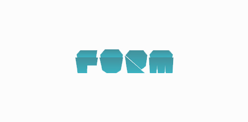
FORM Experimental / concept work


Project for school. Fake brand of organic products. This was the one Ms. Teacher chose.

Logo redesign.
Investing.com is a definitive source for tools and information relating to the financial markets. With a growing readership worldwide it is a leading global financial portal that is constantly committed to launching innovative features and sections to ensure an optimal one-stop source for its readers.

logo for vintage fashion shop
custom type
http://www.facebook.com/yaceky
Suitable for creative agencies or for something similar.

A logo for a spa.
www.nlogo.pl

Travel Pillow Review is a website dedicated to reviewing the best travel pillows available to help people make informed buying decisions. The logo was designed using Gotham Rounded. http://www.travelpillowreview.com/
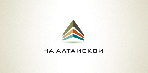
Designer: Denis Aristov Client: Comstrin Industry: Real Estate Keywords: housing, estate, development, building, apartment, modern

"Project developed for the architect Fabricia Cortina, where the inspiration for the brand development was based on the French Curve ruler, an important element of Architecture.”

private security agency


Inspired by the Newtons cradle, i've created an endless logo
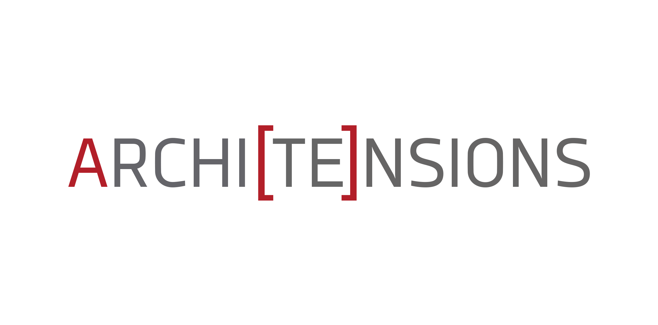
Architectural studio based in Brooklyn, NY - primary logo

Smart NFC

Creative Agency in Russia.

Logo for a local business
Cake Logo Design | B/W
IT Consulting Company located in Washington D.C. specializing in Virtualization, Network Design and Cyber Security

Thinking of bee... Very neath & recognizable brand suitable for many different industries.