Highest rated logos
Highest rated logos – Page 317

VZLETS is specialized on Internet promotion and Social Media Marketing. See more: http://logomachine.net/


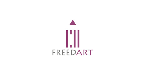
Logo for freedom in art.


logo for a line of baby shampoo and soothing soaps.
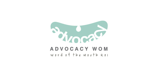
Word of the mouth: It refers to oral communication and the passing of information from person to person. It is a advertising company for promoting customers for goods.

Logo design for charity fund

Logo for Knowledge As A Service, a dutch consultancy for Product Lifecycle Management (Kaas means cheese)

EFEXO is fresh modern dynamic brand with short easy memorable name. It will suite well to any business or industry.
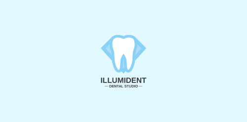
A concept made for a dental studio - premium dental care.

Logo for a company for brand promotion

emblem of plant mining equipment (Tula, Russia)

COOLCAT is fresh modern dynamic brand with short easy memorable name. It will suite well to any business or industry.
competitive work
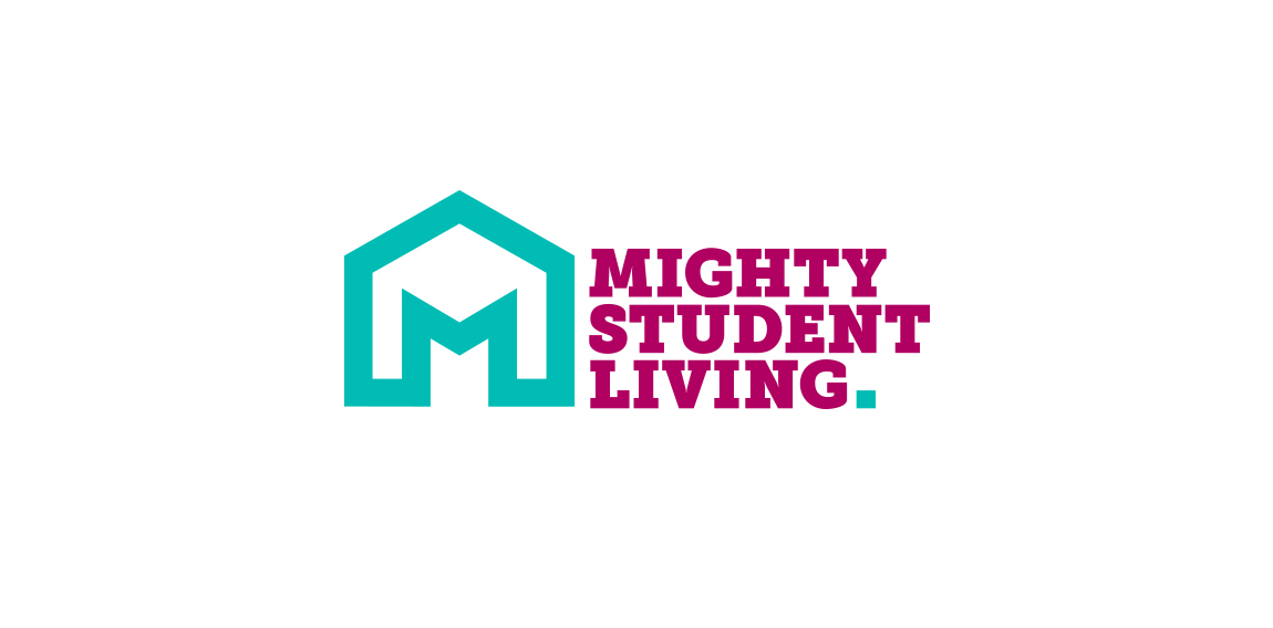
Mighty House founder Peter Charnley already has a very successful high street estate agency, the brand, and website for which was created by Hotfoot, and he approached us again to create a new brand focussed in the highly competitive student market in Lancaster.
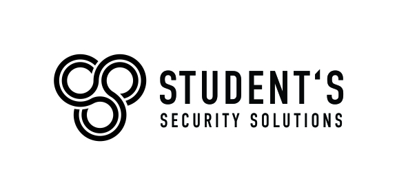
Students Security solution a company that provides different kinds of services like CCTV'S,Fire Alarm and security solution in school and colleges.

Logos for aarchitettura "Best Creativity"

With Adam Films we wanted to categorically move away from the clichés that the name Adam carries with it and we finally froze on ivy leaves which can be seen in historical depictions of Adam & Eve. These ivy leaves, concealing and revealing were in context to techniques used in traditional film making. Adam Films is a collaborative work with Sushil Chintak.
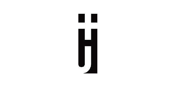
Fitted the H and J in a logo, using negative space

Sophie is freelance writer, she wanted a artsy feel to the her logo ( very approachable ). So, I went with a watercolor approach. The pen head is the basket of the balloon, implying that she lifts people up with her writing.


Logo for t-shirts designers
Indústria de Alimentos

Nothing Set

Taaleem, which means 'education' in Arabic, is committed to inspiring students and helping them to identify and develop their passions and talents. We only recruit the best international teachers who are capable of delivering our international curricula in a creative and engaging manner. Taaleem seeks to raise the educational standards in the region. The combined experience of its core team of senior education leaders in international education policy, operations and global management best practices means Taaleem is well positioned to ensure the creative of truly exceptional schools that satisfy the most comprehensive and exacting education developmental requirements.