Highest rated logos
Highest rated logos – Page 183
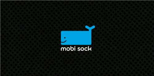
Mobi Sock is a contemporary styled, rectangular shaped, fabric-knit "sock" with draw string (hence the whale's tail) to protect cell phones, ipods and other mobile electronic devices.


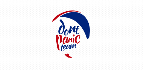
Logo for a Paragliding team from Venezuela


http://wp.me/s4571j-futuremo

Logo for a new tourism company that offers free walking tours in NYC.
FALLON is fresh modern dynamic brand with short easy memorable name. It will suite well to any business or industry.

Logo for school of programmers.

Corporate ID for Physician's Optical - Optician and Optical Wear
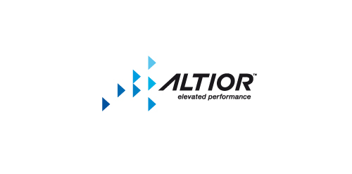
Rebranding for Altior, which is a technology company. Altior develops hardware acceleration solutions that boost protocol execution performance in embedded systems.
The top 3 core values which should be delivered by the logo are:
1. speed / peak performance
2. efficiency &
3. reduced power needs
www.altior.com

Unused logo proposal for a horse sports.

Brudzew

CHROMONA is fresh modern dynamic brand with short easy memorable name. It will suite well to any business or industry


Made for fun.

Logo for company which utilizes Otolaryngologists, Audiologists and Hearing Instrument Specialists to test hearing, recommends communication strategies and provides hearing aids and service

Logo for my logo design site - www.outofcrowdlogo.com.

Customizable Ready Made Logo Design at http://wp.me/p4571j-5a


CastedCare provides onsite support to cancer patients. The logo uses the memorial ribbon with two hands in a supportive form


A logo for a consumer seafood business. I chose to encapsulate a fish, fishhook, and the company initial, 'S' in the mark.
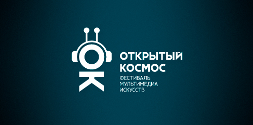
Designer: Denis Aristov Client: The Government of Perm Region Iindustry: Festival, Event Keywords: festival, event, multimedia, technology, electronic, music, free space, cosmos, outer space, open space, OK, initials, cosmonaut, spaceman, astronaut, video, art, ear-phones, antenna, Perm