Highest rated logos
Highest rated logos – Page 127

Logo for a bridge club. Composed with 9's and 6's, together present table with four seats for players.


VICTORA is fresh modern dynamic brand with short easy memorable name. It will suite well to any business or industry.
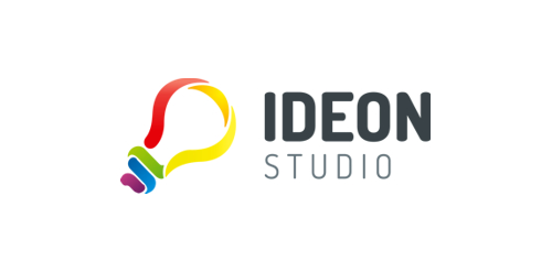
Creative colorful bulb

A logo concept for a mobile app
Some experiment about verbicon, i hope you like :)
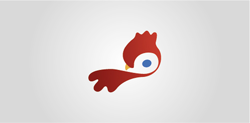
little Bird logotype

The logo has the concept of joining the letter H with the hexagon. This union of the two elements occurs in a fluid and joint way, making both a symbol only. The graphical effects used give the symbol depth and dimension. For lettering, an easy-to-read format was designed , which refers to the technology area. Details in each letter and adjustments give the feeling of agility and exclusivity to the name of the company.

Brand design for nutritionist. 2017, Dourados, Brazil Brand concept: Knowledge for a healthy life. Heart + Fruit + Tree (symbolizing life, health, knowledge and growth).

Logo created for a line of aluminum frames.
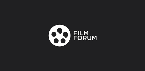
Conceptual logo showing a film spool and quotation marks.

Logo for catering agency (food served by models)


Minimalistic, simple and modern shape makes this logo easy recognizable and memorable. It's clean and clever, resembling lifting upward, to the skies - which resembles growth and success. Subtle gold/navy color scheme symbolize elegance and luxury and bold, prominent icon symbolize stability and trust in brand.

logo for languag learning portal

This is a foreign startup company in China that offers a complete interior landscaping/ plantscaping service for commerical space (offices, lobbies, conference centres, Hotels, Malls, Airports etc). The service includes design consultation, container and plant selection, project installation, and post-installation project maintenance.

bulb n candle
Logo for Pencilope.

Boutique resort at Phuket Thailand
Logo process and branding: https://www.behance.net/gallery/31767063/Peaceful-Bay-Logo-Branding A wine company requested a logo that would represent Peaceful Bay a region located in a South -West Australia. Doing some research, I found out that whales visit the southern Ocean, a great symbol for the label and name. After multiple sketches this is the final result.

This was designed for a cafe,i always try to keep my designs simple and clean and this is one of those simple and clean logos.

Exclusive Customizable Logo at http://wp.me/p4571j-5D
"PB" monogram for fun. Monogram is for sale.

Logotype for website about Sochi town

Parrot multicolor