Highest rated logos
Highest rated logos – Page 12

Logo for marine port


This logo is all about chocolate! A simple silhouette but a clear statement for those who love chocolate in all its forms.
Sequioa
Logo for Neck

https://www.behance.net/gallery/16906829/Teaura This brand has a strategic objective to represent and communicate through a set of visual signs, quality, simplicity and modernity; predominant modulation of their strokes and endings. Tea Leaf: The leaf or bud tea plant is essential to our identity, which is a more representative and traditional element. Source: strokes and terminations Chinese signs were taken into account to make the brand Tèaura as the Tea originally comes from China.

Privè Club's Logo
New brand of crochet swimwear, bikini and tops.


Ingenious modern logo. For sale!
G lion (Great lion). A logo for the Swedish company "G Lion" that manufactures and sells leather cases for cell phones and tablets...
I decided to challenge myself to create logotypes everyday with random words.
Owl logo just for fun. www.ashflint.com
Logo para o departamento de Vigilância Ambiental da prefeitura de São José do Rio Preto

We are a craft coffee company that takes pride in educating our customers on third wave coffee as well as continually striving to offer the perfect cup of coffee. Eventually we will be roasting personally sourced coffee beans in house.
"Ferona" (fertility clinic)- logo.

Digital marketing company
A logo for a dog wash station called "Bubble dog wash".
Guardian logo
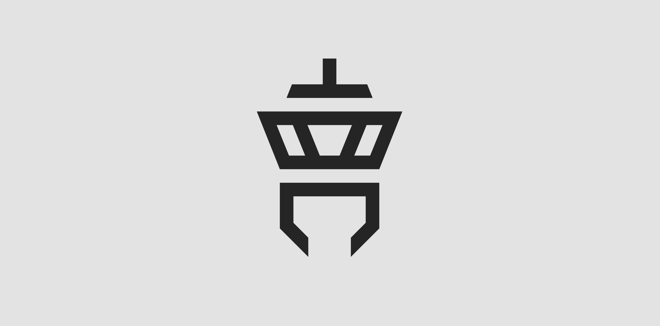
Client: Tower Communication The customer‘s wish was to have an abstract depiction of an airport tower in the logo. The antenna of the tower is an upside down T (for “Tower“) and the lower area is a downwardly open C (for “Communication“).
Logo for company of the agricultural sector. New Andradina, Brazil.
Slide verbicon
Elegant horse silhouette logo. Unused proposal.
Bull- logo.