Highest rated logos
Highest rated logos – Page 15
Logo for record label.


Dog and Owl shop logo design. Owl is below the dog.
The logo concept of a financial firm that connects companies from the Croatia, Slovenia, Bosnia and Serbia with investors from Western Europe, North America, Asia and the Middle East.
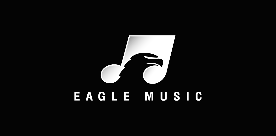
A nice and clever negative space logo featuring a musical note having an Eagle's head placed inside of it as hidden or negative space.
My personal brand symbol.

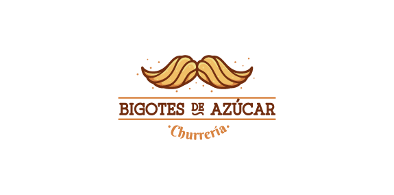
Logo for a mexican "churros" business with a nice concept. Worked at Design Agency * Identity design by Frank Reyes
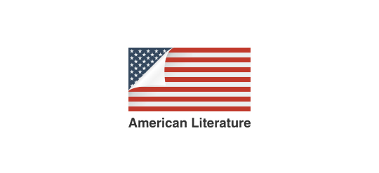
A simple idea using a page curl to reveal the American flag.

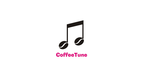
Radio Cafe
Design Bomb (Graphic Design Studio)
http://dribbble.com/shots/1485572-Design-Bomb
Logo for Wedding Salon

logo for a clinical nutrition specialist based in mexico.
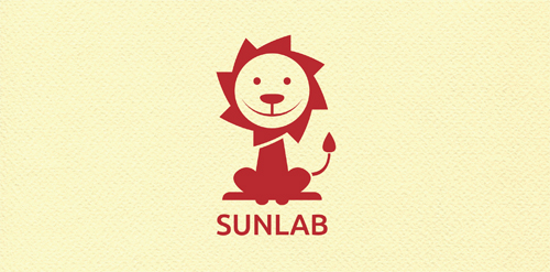
great logo for the children and clean energy! SUNLAB can be understood as the laboratory of the sun, which symbolizes light and hope in life and can also be used for charitable purposes and business non-profit organization that helps children in need of care
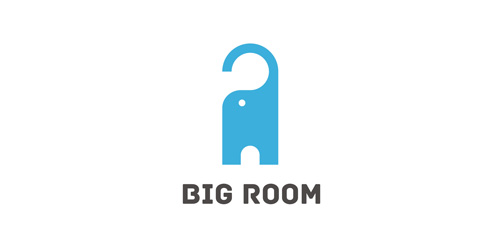
Blend of elephant (big) and door label (hanger). For sale.
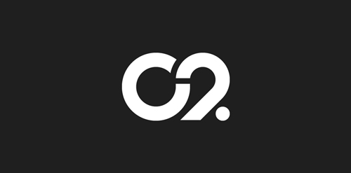
The city of Torcy, France recently built a great complex dedicated to the promotion of Culture & Arts, highlighting local and national artists. I was contacted to work on its complete Brand Identity, including Naming, Logotype, visual identity, Print communication, exterior & interior signage, website design and clothing.
The main goal was to create a total new and innovative identity. Naming took a great part in that sense. I focused on trying to create a simple yet effective name for that building. C2 was chosen from a couple of hundred names for its international recognition, pronunciation and readibility. It stands simply for Cultural Center or the two initials 2xC -> C2.
As far as the logo is concerned, it followed in a logical way the naming process. A will to create a modern and contemporary logotype, yet efficient, minimal, powerful and durable. It was created so it could nicely fit and be readable at a great or tiny size on any document. The logotype guidelines show a slight dipping of the « C » and the « . » to create the optical illusion that all characters are aligned on the same baseline.

Ready Made Logo at https://eisaks.wordpress.com/2014/01/23/myway/

.
TELFOR (Telecommunications Forum).
Cyclops
A monogram for a prsonal trainer
Colibri by Boldflower Design Studio,Contact me:meksikositi@gmail.com
...

Huuuge logo search for Taganka Brewery. Full search: https://www.behance.net/portfolio/editor?project_id=63651085
Sfera by Boldflower Design Studio Contact me: meksikositi@gmail.com