LogoMoose
  • Logo
    Galleries
    • Featured logos
    • Most rated logos
    • Most viewed logos
  • Identity
    Galleries
    • Featured identities
  • Packaging
    Galleries
    • Featured Packaging
  • Designers
  • Competition
  • Upload
  • Become Member
  • Login

Tèaura

  Tèaura  
Tèaura
Facebook
fb-share-icon
Pinterest
Reddit
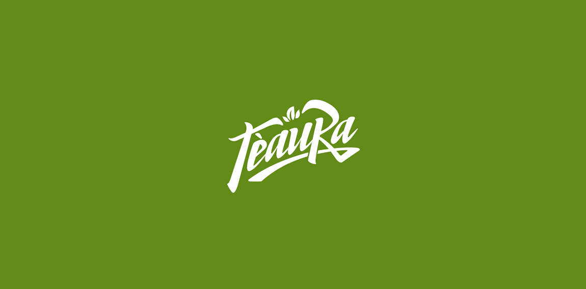
  • https://www.behance.net/gallery/16906829/Teaura This brand has a strategic objective to represent and communicate through a set of visual signs, quality, simplicity and modernity; predominant modulation of their strokes and endings. Tea Leaf: The leaf or bud tea plant is essential to our identity, which is a more representative and traditional element. Source: strokes and terminations Chinese signs were taken into account to make the brand Tèaura as the Tea originally comes from China.logomoose_teaura_birpip Designer: BIRPIP
  • Submitted: 08/12/2016  •   Featured: 09/17/2016
  • AwardedSeptember 2016
  • Stats: This logo design has 21272 views and is 0 times added to someone's favorites. It has 12 votes with an average of 4.25 out of 5.
  • BIRPIP
  • brand
  • branding
  • identity
  • logo
  • logo supreme
  • logo te
  • logo tea
  • logotype
  Designer  

BIRPIP

View portfolio

  More logo design  
scisorss

guestComments3Sep-15-09
банк Фамільний

Oсновным фирменным цветом является коричневый цвет, близкий к шоколадному. Ключевые значения и символика коричневого цвета – «мать-Земля, дающая жизнь всему живому», «надежность», «трудолюбие», «преданность». Основа логотипа – это образ дерева, которое дает потребителям чувства уверенности, устойчивости, силы, вечности. Объединение коричневого и бежевого цветов воспринимается потребителями как энергетически сильное, поддерживающее чувство «уверенность в завтрашнем дне». Дополнительный серый (платиновый) цвет добавляет образу бренда такие черты, как «сдержанная роскошь» и «прагматизм».

tortillaComments0Nov-13-11
método radaic™

logo for a graphology therapy firm based in brazil.

pizelatoComments0Jul-07-16
Da-Bud

The logo was created for a company offering glass services in Wroclaw, Poland.

eddieComments0Sep-09-16

  About  

LogoMoose is an inspiration and design community that was launched in 2008. It showcases logos, identities and packaging submitted by professional designers, design studios or agencies. We showcase the best work from the best designers from around the globe. Become a member now and create your own portfolio!

Get your daily dose of inspiration to work on your own design projects and get your business moving. Be amazed by our logos, identities and packaging on this worldwide platform. We‘re here to inspire you and help you impress your clients and fellow designers. Get an overview of global trends in logos, identities and packaging. Browse our galleries and discover all the latest design trends.
We know you love your work!

© 2008 - 2025 LogoMoose.com - All logos are property of their respective owners.
FAQ - Privacy Policy - Imprint