Featured logos
Featured logos – Page 95
Logo for beauty salon.


Custom letters made for australian company specializing in UPS systems. - - - follow us on www.instagram.com/triptic.pl

An option logo for architecture company

Logotype created for China based web & mobile apps developer. - - - follow us on www.instagram.com/triptic.pl

DESIGNER
Khan the Conqueror

Logo design for independent consulting firm
Logo design for band GreenLights.
Logo for small design agency
Logo design for a community which connects all the entertainment networks.
Logo perfect for fashion industry. It is for sale.
Monogram for letter K.
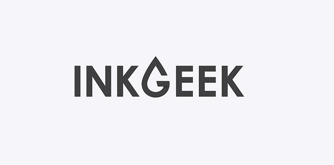
The Inkgeek logo utilizes a minimal and flat design. A typographic G is featured in the shape of a droplet of ink.

The Motor City Chop Shop logo features a flowing action, created with curved letters, lines and shapes. All of these elements combined create a raw, compelling feeling of a chopper in motion.
Hospital
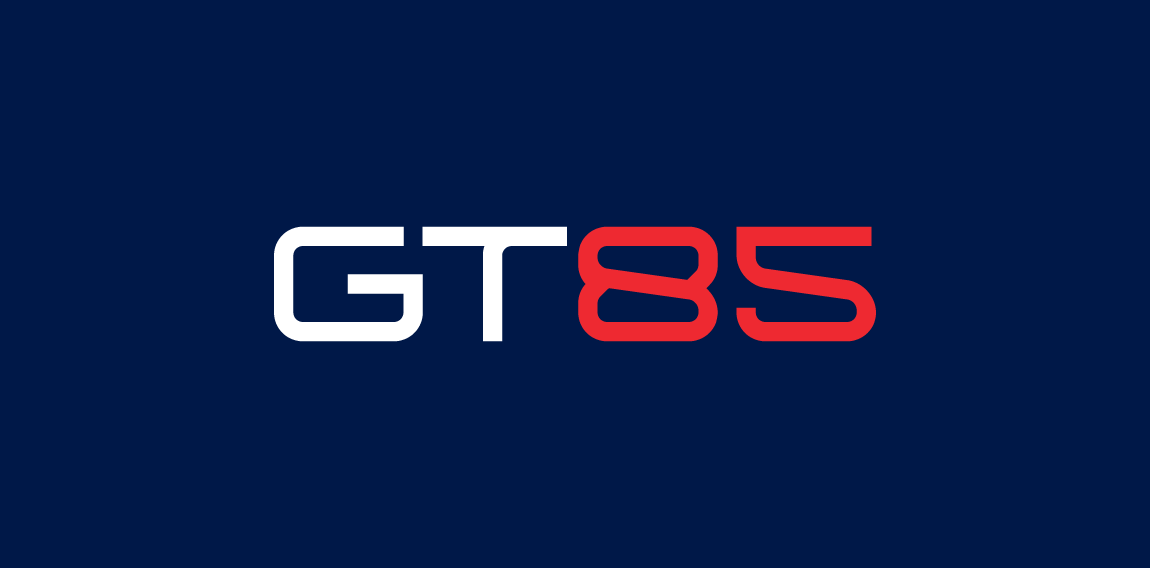
GT85 is a company providing innovative and comprehensive technology solutions for the industry. General concept was to create a transparent, industrial and technological identity. Unrealized project. • • • Full view and description on https://www.behance.net/gallery/29066969/GT85 • • • Follow us on www.instagram.com/triptic.pl

Musical type logo concept
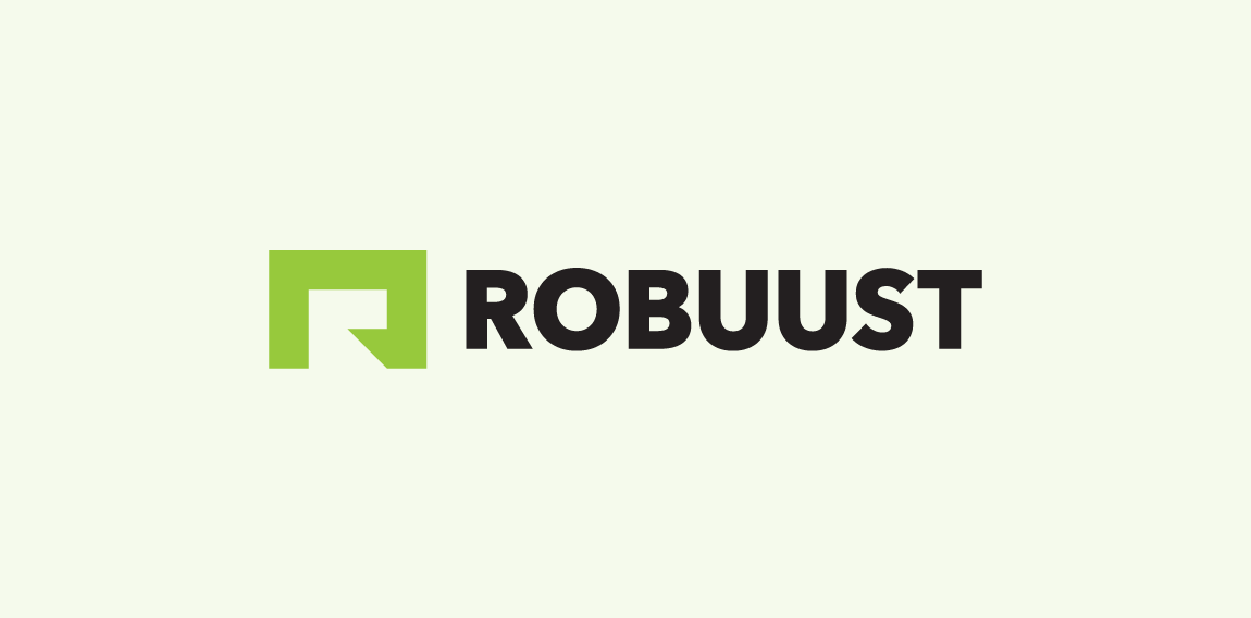
Robuust Media is a Dutch internet agency.

Logo for a creative agency. Letters C and U are combined into a paperclip which symbolize union and one of the tip of the paperclip is formed as a pencil - a symbol of creativity.
Mert Gündoğdu / Photographer

The idea of the logo was to take letters O and X and put them together to create round area of the blue sky as a background and the shape of a white plane as a letter X.
Mark for company manufacturer high quality specialized paints and varnishes. • • • Follow us on www.instagram.com/triptic.pl
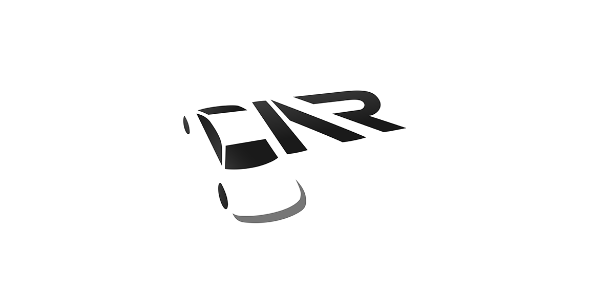
CAR

Outdoor equipment service. Reparations of damage to outdoor clothing, changing of zippers and velcro strips, reinforcement of weak areas on ski pants with Kevlar, washing and impregnation of shell jackets, washing of dun jackets and sleeping bags, grinding of skis, resoling of climbing shoes, impregnation of tents, alterations to length on various membrane clothing and service of F-16 fighter jets. Outdoor Equipment is owned by Fleur Pearson who has been a tailor since 1994 and also houses Gore-tex Service Center Denmark.