Featured logos
Featured logos – Page 8
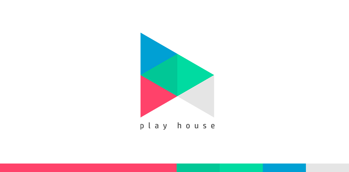
Play + H + House


Eagles look (hair salon)- logo.
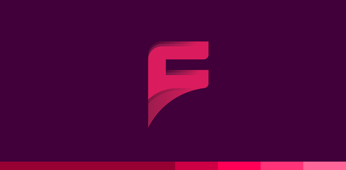
F Alphabet
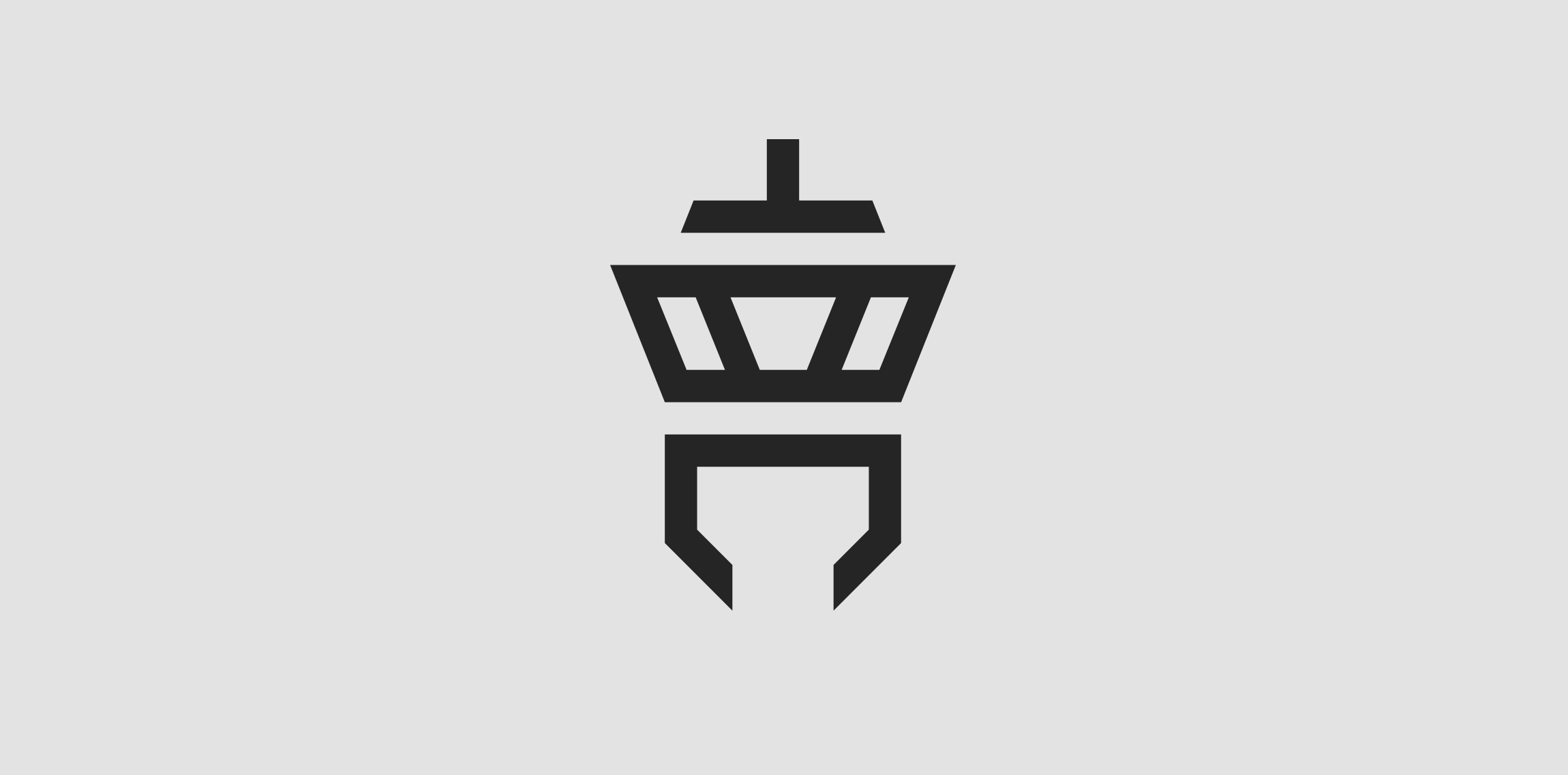
Client: Tower Communication The customer‘s wish was to have an abstract depiction of an airport tower in the logo. The antenna of the tower is an upside down T (for “Tower“) and the lower area is a downwardly open C (for “Communication“).
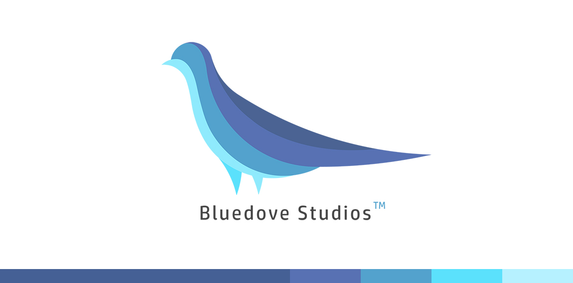
Dove
Sfera by Boldflower Design Studio Contact me: meksikositi@gmail.com
Fine Line Accounting Logo Typographic logo design
It contains two letters G in one symbol.
X + Butterfly
Turbo logo
A + Alpha
(Map) Pin + Bird
S + Pot + Bowl
A monogram for a prsonal trainer
Shine Logo
My personal logo. The name “viuze“ means “vivid colour light“ and is a composition of the english word “vivid“, the spanish word “luz“ (=light) and the german word “Farbe“ (=colour).
Logo design for an approved building inspector PRO Building Control.
We created a symbol based on an abstract building. A prominent square showing a fire escape route, in the form of a tick, was laid on top of an outlined square representing the solid foundations PRO work from.
KOBALT pracownia projektowa
Talius by Boldflower Design Studio,contact me: meksikositi@gmail.com
GI Monogram - Unused
logo for a nutrition specialist based in mexico.
Tie + Book (Unused)
logo for a concrete products company based in mexico.
Sixth Saving Operation - S + O + 6 in one symbol