Featured logos
Featured logos – Page 152

Nothing set but u can check simply CI here http://bit.ly/Nb8pyc


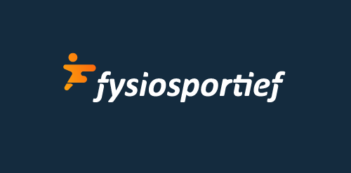
Logo design for a Dutch sport physiotherapy company called 'fysiosportief'. They asked me to come up with a new refreshing logo for their business. The client preferred the type to be custom and as friendly looking, easy to read and a little twist integrated in it that shows some sort of speed and dynamic. The icon is a combination with the letter 'F' together with a running human. Also tried to perfect the balance by adding that same shadow effect from the typo.

ATRINOX is fresh modern dynamic brand with short easy memorable name. It will suite well to any business or industry.

This is the logo of a fanpage Facebook. The Dehand is the place to share guide for DIY & Crafts, Handmade... Visit fanpage: www.facebook.com/thedehand

NEARQ
Funbike logo
Personal branding for Ross Jackson head chef of Nordic Kitchen.
Ross is famous for his fresh soup recipes therefore RJ monogram is created from two soup ladles which also creates letter N as Nordic Kitchen.
more at: http://logopond.com/gallery/detail/213182

Skydiving Website
Hand-lettered logo design for Rooster Guitars. Designed by: www.studioefficio.com

Logo for a tour guide in Alexandria.

hole concept
Videography Logo
Design Bomb (Graphic Design Studio)
http://dribbble.com/shots/1485572-Design-Bomb
Client: Ledstrip Location : Israel Branding Agency: Bratus
CafeFinder (Find a coffee shop | Locate your nearest cafes)
http://dribbble.com/shots/1481048-CafeFinder

Portofinio Trading Limited is a company who sell promotional materials, and also provide technology equipment to businesses.
After careful thought, in its most basic form the Portofino Trading Ltd product offering (be it promotional items or technology) helps business build connections to grow and succeed. The icon here has been designed to represent the idea of being ‘continuously connected’, growing, adapting and developing. Follow the line in either direction, and at its core you are taken back out towards a different location. Interlocking like a chain that never ends. Also looking like a propeller to represent the clients success with the support and guidance from Portofino Trading Ltd.
This icon also represents the companies ability to build relationships, and quickly adapt and see trends.
Overall the design is confident, timeless, and gives the impression of an established and trustworthy business.
View more information here: http://logogeek.co.uk/?portfolio=portofino-trading-limited
Fun logo. Stop. Eat. Go. You can buy it if you like.
Indústria de Alimentos

This logo was developed for Heim by VisualCast Designology. Heim is the authorised international distributor of Leicht Kuchen and Rolf Benz, which are Germany high-end home furnishings brand. Heim’s retail stores is located in Surabaya and Jakarta, Indonesia. The logo is comprised of clean, simple and modern custom-made lowercase typeface. The feel from the logo is personal and luxurious. More information available at http://www.visual-cast.com.

Client: Dream Photo Tour Location: US Branding Agency: Bratus
Studio Orange Photography (Camera viewfinder + Orange)
http://dribbble.com/shots/1481139-Studio-Orange-Photography

Unused proposal for courier company located in Kuvait. Zitat in Kuwait traditional language means "faster" or "fast". "Ghutra" (Arabic Scarf) is a traditional Middle Eastern headdress.
logo for horizon on and on, italy

Kvadrat