

LogoMoose
  • Logo
    Galleries
    • Featured logos
    • Most rated logos
    • Most viewed logos
  • Identity
    Galleries
    • Featured identities
  • Packaging
    Galleries
    • Featured Packaging
  • Designers
  • Competition
  • Upload
  • Become Member
  • Login

Portofinio Trading Limited

  Portofinio Trading Limited  
Portofinio Trading Limited
Facebook
fb-share-icon
Pinterest
Reddit
  • Portofinio Trading Limited is a company who sell promotional materials, and also provide technology equipment to businesses.

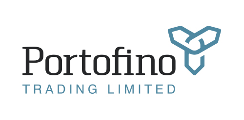
    After careful thought, in its most basic form the Portofino Trading Ltd product offering (be it promotional items or technology) helps business build connections to grow and succeed. The icon here has been designed to represent the idea of being ‘continuously connected’, growing, adapting and developing. Follow the line in either direction, and at its core you are taken back out towards a different location. Interlocking like a chain that never ends. Also looking like a propeller to represent the clients success with the support and guidance from Portofino Trading Ltd.

    This icon also represents the companies ability to build relationships, and quickly adapt and see trends.

    Overall the design is confident, timeless, and gives the impression of an established and trustworthy business.

    View more information here: http://logogeek.co.uk/?portfolio=portofino-trading-limitedPortofinio Trading Limited Designer: Ian Paget
  • Submitted: 03/24/2014  •   Featured: 04/19/2014
  • Stats: This logo design has 4341 views and is 0 times added to someone's favorites. It has 4 votes with an average of 2.25 out of 5.
  • b2b
  • computing
  • connections
  • Ian Paget
  • IT
  • link
  • links
  • network
  • Networking
  • professional
  • promotional
  • trading
  Designer  

Ian Paget

View portfolio

  More logo design  
CENOXO

CENOXO - logo design. Based on customized typeface, strong C logo mark, technology, brain, development and connection.

radekblaskaComments3Mar-24-15
Constravia

Architectural design bureau. Designing in building. Technical advice. The name "constravia" relates to the scandinavian roots of the bureau founder (construction+scandinavia). The mark relates to the letter "C".

nickosmaComments0Feb-23-11
Lettings London

One of concepts for London based flat rental online service • • • Most important thing was to use british color palette and avoid typical elements as houses, doors etc. • • • Follow us on www.instagram.com/triptic.pl

alekchmuraComments0Sep-27-15
Idea Ahead

The company is involved in business communication (Retail Trends magazine issue, retail360 web service, organization of business events). All of this revolves around communication, marketing, media and advertising.

apixComments0Nov-10-14

  About  

LogoMoose is an inspiration and design community that was launched in 2008. It showcases logos, identities and packaging submitted by professional designers, design studios or agencies. We showcase the best work from the best designers from around the globe. Become a member now and create your own portfolio!

Get your daily dose of inspiration to work on your own design projects and get your business moving. Be amazed by our logos, identities and packaging on this worldwide platform. We‘re here to inspire you and help you impress your clients and fellow designers. Get an overview of global trends in logos, identities and packaging. Browse our galleries and discover all the latest design trends.
We know you love your work!

© 2008 - 2026 LogoMoose.com - All logos are property of their respective owners.
FAQ - Privacy Policy - Imprint