LogoMoose Logo Inspiration
  • Logo
    Galleries
    • Featured logos
    • Most rated logos
    • Most viewed logos
  • Identity
    Galleries
    • Featured identities
  • Packaging
    Galleries
    • Featured Packaging
  • Designers
  • Upload
  • Become Member
  • Login

Diploma Healthcare Group

  Diploma Healthcare Group  
Diploma Healthcare Group
Facebook
fb-share-icon
Pinterest
Reddit
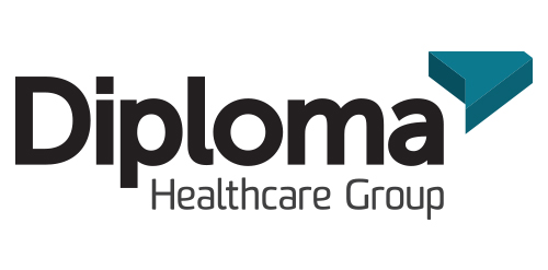
  • Inspired by the ancient Japanese art of folding paper, the negative space from an origami-styled “D” creates Diploma’s icon. Using a deep charcoal colour treatment on a bold stylized version of the Museo Sans typeface, the identity combines vivid aqua and chartreuse colours, designed to strengthen the company’s fortified position as “the definitive partner for medical device sales in specialized healthcare markets.”Diploma Healthcare Group Designer: urbanjungle
  • Submitted: 01/29/2013  •   Featured: 01/29/2013
  • Stats: This logo design has 3778 views and is 0 times added to someone's favorites. It has 2 votes with an average of 1.50 out of 5.
  • black
  • blue
  • d
  • extrusion
  • healthcare
  • medical
  • museo sans
  • origami
  • sans serif
  • sommet rounded
  • urbanjungle

  Designer  

urbanjungle

View portfolio

  More logo design  

Melesca

Wine shop located in Mendoza, known as the city of the good wine. It offers a great variety of high quality products (wines and craft beer among others) as well as personalized services resulting in excellent customer care.

birpipComments0May-04-17
Russian Chess Association

A simple and unique logo design showing a chess horse/knight with a hammer, sickle and star in the negative space. Unused proposal. For sale.

square69Comments1Feb-01-17
spicy

spicy restaurant

yacekyComments7Jul-26-11
C2

The city of Torcy, France recently built a great complex dedicated to the promotion of Culture & Arts, highlighting local and national artists. I was contacted to work on its complete Brand Identity, including Naming, Logotype, visual identity, Print communication, exterior & interior signage, website design and clothing.

The main goal was to create a total new and innovative identity. Naming took a great part in that sense. I focused on trying to create a simple yet effective name for that building. C2 was chosen from a couple of hundred names for its international recognition, pronunciation and readibility. It stands simply for Cultural Center or the two initials 2xC -> C2.

As far as the logo is concerned, it followed in a logical way the naming process. A will to create a modern and contemporary logotype, yet efficient, minimal, powerful and durable. It was created so it could nicely fit and be readable at a great or tiny size on any document. The logotype guidelines show a slight dipping of the « C » and the « . » to create the optical illusion that all characters are aligned on the same baseline.

fjuillotComments1Dec-10-13

  About  

Logo Inspiration showcases logos, identities and packaging
We are an inspiration and design community that was founded in 2008.
Here, we showcase logos, brand identities and packaging designs created by professional designers, design studios and agencies. We showcase the best work from the best designers from
Join us and upload your work! Register here!

© 2008 - 2026 LogoMoose.com - All logos are property of their respective owners.
FAQ - Privacy Policy - Imprint