Tedsom
Tedsom


- Human resources company.
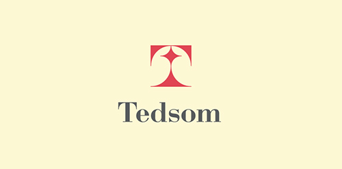
Half-symbolic, half-typographic concept. I have started with a concept of a road leading ahead, with a guiding star above, showing the way. Then, I had to add top serifs to get the letter "T", and with a little stretch of imagination it could be interpreted (or rather the negative space it creates) as the night-sky`s sphere.
I am pretty happy with the shape I have ended up with. It is purely geometric, simple, elegant, unique and strong. Of course it is also the initial of the company name, and the hidden message can be viewed as added value.
keywords: "T", professional, trustworthy, solid, experienced, elegant, simple, guidance Designer: midgar
 - Submitted: 04/16/2012 • Featured: 05/31/2012
- Stats: This logo design has 7137 views and is 1 times added to someone's favorites. It has 3 votes with an average of 3.00 out of 5.
Designer