
T logos (17)
Hello everybody :) I just launched my new website so if you have time, please visit it and let me know your thoughts - if not, just left a homophobic comment :) www.triptic.pl


Symbol for one of my current projects. T + M.

An initial logo that was designed for high end technological company.
Urban Jungle took a graphical approach to Terrapro‘s identity, drawing from the colour and shape of their flagship product—the synthetic rig mat. The cropped corner of the rig mat’s design, was integrated through all aspects of Terrapro’s design system, including their letterhead and business cards and website.

The Peoples Fitness is a website providing information, articles and advice for fitness and gym users. The concept was a monogram of the letters 'T,P & F'.

When you are gone, me too
Human resources company.
Half-symbolic, half-typographic concept. I have started with a concept of a road leading ahead, with a guiding star above, showing the way. Then, I had to add top serifs to get the letter "T", and with a little stretch of imagination it could be interpreted (or rather the negative space it creates) as the night-sky`s sphere.
I am pretty happy with the shape I have ended up with. It is purely geometric, simple, elegant, unique and strong. Of course it is also the initial of the company name, and the hidden message can be viewed as added value.
keywords: "T", professional, trustworthy, solid, experienced, elegant, simple, guidance
One of the logo concepts I did for music artist Taio Cruz.

Designer: Denis Aristov Client: Panorama Industry: Food Keywords: tapas, bar, bull, Spain, bullfights, corrida, food, red, yellow, round, arena, sun, sand, typographic, T, horns
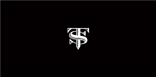
Proposal for TS (formerly named Top Streetwear), a youth fashion brand.

Proposed concept.

Logo for company which offers technical and geological services in the mining sector. The mark is inspired from from the shape of the 'prospector hammer".The varied colors /sections symbolize the numerous data and information that the company collects and presents in a compact form to its clients .The colors and section also communicate the idea that the company is adept at exploring varied terrains and areas