

LogoMoose Logo Inspiration
  • Logo
    Galleries
    • Featured logos
    • Most rated logos
    • Most viewed logos
  • Identity
    Galleries
    • Featured identities
  • Packaging
    Galleries
    • Featured Packaging
  • Designers
  • Upload
  • Become Member
  • Login

FanSite

  FanSite  

FanSite
Facebook
fb-share-icon
Pinterest
Reddit
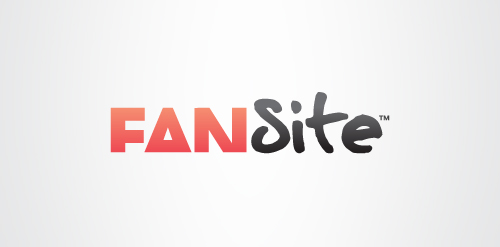
  • Here is one option for a logo and branding project for a brand new social network. It revolves around the idea that through Fansite, fans can meet other fans through their common interest in a musician, sports star or celebrity etc. This is signified by the choice of typefaces; ‘Fan’ is in one typeface while ‘Site’ is in another. The two typefaces have been chosen carefully to offer all the right messages and personality. ‘Site’ is written in a hand written typeface, inspired by a celebrity’s autograph which helps give the logotype a unique identity. ‘Fan’ is written in a modern, 'cropped' typeface that represents the fan community and social network aspect of Fansite. Fansite is a modern, digital equivalent of a fan scrapbook or fanzine, or at least this forms the basis. The 'Fan' typeface is modern and has a strong relevant personality itself, but it is treated in a unique way. Each letter is tightly cropped, yet still legible, inspired from old fanzines when fans would use scissors to cut and layout their magazines.FanSite Designer: Tim Smith
  • Submitted: 02/24/2012
  • Stats: This logo design has 3899 views and is 0 times added to someone's favorites. It has 4 votes with an average of 3.00 out of 5.
  • black
  • brain
  • cropped
  • fan
  • fansite
  • hand
  • logo
  • logotype
  • my
  • network
  • poor
  • red
  • site
  • smith
  • social
  • tim
  • Tim Smith
  • type
  • written

  Designer  

Tim Smith

View portfolio

  More logo design  

bird

bird

mattmartComments0Nov-02-17
Seascape

A logo design for travel agency, hotel and beach resort, film production and marine life conservation.

knyleComments0Feb-03-16
Koloroo

guestComments1Nov-26-08
IDORO

IDORO creates custom pure gold busts for clients in the Middle East. The whole company has an antique vibe, represented partly by the Name, which combines "Adoro"(=ital. Love)/"ID"(=Identity) and "Oro" (=ital. Gold). As well as by the Logo itself, which has elements of an antique helmet and a falcon representing luxury and power.

freakyphil1Comments1Dec-27-14

  About  

Logo Inspiration showcases logos, identities and packaging
We are an inspiration and design community that was founded in 2008.
Here, we showcase logos, brand identities and packaging designs created by professional designers, design studios and agencies. We showcase the best work from the best designers from
Join us and upload your work! Register here!

© 2008 - 2026 LogoMoose.com - All logos are property of their respective owners.
FAQ - Privacy Policy - Imprint