July 2017 logos (99)

Brand design for nutritionist. 2017, Dourados, Brazil Brand concept: Knowledge for a healthy life. Heart + Fruit + Tree (symbolizing life, health, knowledge and growth).


Pixeland logo

Victoria is a financial fund based in Warsaw. The key was to combine a eagle (symbol of Poland) and V letter (for Victoria). There were several concepts - some modern, some classic, more decorative with a pinch of victorian styling.
Logo for TMVectors

Qualitalia is a Italian language school based in Warsaw/Poland. We combined letter Q with colloseo and italian flag.
Modern logo design with a lovely gradient that can suit any business or service. This logo is for sale at suitablelogos.com

Travel Pillow Review is a website dedicated to reviewing the best travel pillows available to help people make informed buying decisions. The logo was designed using Gotham Rounded. http://www.travelpillowreview.com/

Ape Lu is a italian fashion boutique located in the most fashionable street in Warsaw/Poland. Ape means Bee in Italian and the client wanted it to be in the symbol. We wanted to keep it clean, elegant and modern.

Sunny Wines is a small wine importer from Warsaw/Poland. The aim was to combine letters SW with wine symbols like grapes or cork screw, but the client wanted to see also more elegant symbol combining those letters.

Victoria is a financial fund based in Warsaw. The key was to combine a eagle (symbol of Poland) and V letter (for Victoria). There were several concepts - some modern, some classic, more decorative with a pinch of victorian styling.

The United States has a broken mental health care system that makes it challenging for patients to find affordable, dignified, and quality care.

Victoria is a financial fund based in Warsaw. The key was to combine a eagle (symbol of Poland) and V letter (for Victoria). There were several concepts - some modern, some classic, more decorative with a pinch of victorian styling.
Frestnutri logo design!
Check out my work on behance: https://www.behance.net/dainogodsgn
And my channel: www.youtube.com/dainogo

About We are an online food ordering service that helps customers find restaurants in their area, filter by cuisine, browse menus and place their orders with an option of online payment or cash on delivery. We offer our services through desktops and mobile apps for iPhone, Android, iPad and windows. Our main aim is to become and remain the market leader in the MENA region by diversifying our services portfolio and providing best-in-class customer experience. Green Deliver G + D

aarto is a small architecture design studio based in Warsaw/Poland. The aim was to diffirentiate 3 areas of expertise: Architecture - Urban planning - Interior design. We wanted to keep it simple and modern.

Home Paint logo

Bike Publication
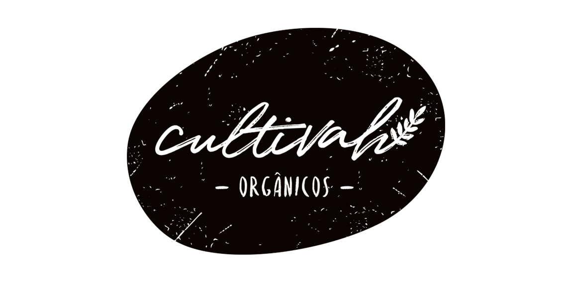
The lettering constructed irregularly, as if it had been drawn by hand, expresses the organic aesthetics of Cultivah. The branch, which extends throughout the lettering, as if it had germinated, contemplates the main product of the company, the one of vegetal origin. Finally, the noises present throughout the brand, its imperfections, illustrate the in natura language of business, free from external agents and conceived in its purest form.