September 2015 logos (87)

Musical type logo concept


Robuust Media is a Dutch internet agency.

Logo for a creative agency. Letters C and U are combined into a paperclip which symbolize union and one of the tip of the paperclip is formed as a pencil - a symbol of creativity.
Mert Gündoğdu / Photographer

The idea of the logo was to take letters O and X and put them together to create round area of the blue sky as a background and the shape of a white plane as a letter X.
Mark for company manufacturer high quality specialized paints and varnishes. • • • Follow us on www.instagram.com/triptic.pl
CAR

Outdoor equipment service. Reparations of damage to outdoor clothing, changing of zippers and velcro strips, reinforcement of weak areas on ski pants with Kevlar, washing and impregnation of shell jackets, washing of dun jackets and sleeping bags, grinding of skis, resoling of climbing shoes, impregnation of tents, alterations to length on various membrane clothing and service of F-16 fighter jets. Outdoor Equipment is owned by Fleur Pearson who has been a tailor since 1994 and also houses Gore-tex Service Center Denmark.

The økotaste.dk webshop sells high quality ecological food products – primarily food oils, pasta, flour and juice.
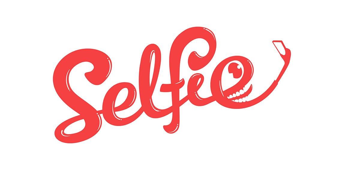
Selfie
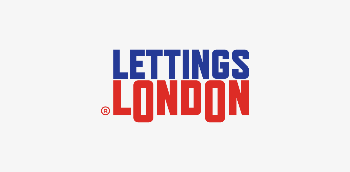
One of concepts for London based flat rental online service • • • Most important thing was to use british color palette and avoid typical elements as houses, doors etc. • • • Follow us on www.instagram.com/triptic.pl

Logotype made for devamjewelry.com - manufacturer of unique & luxury jewelry adorned with diamonds and gemstones. • • • Made for Twindots (UK) • • • Follow us on www.instagram.com/triptic.pl
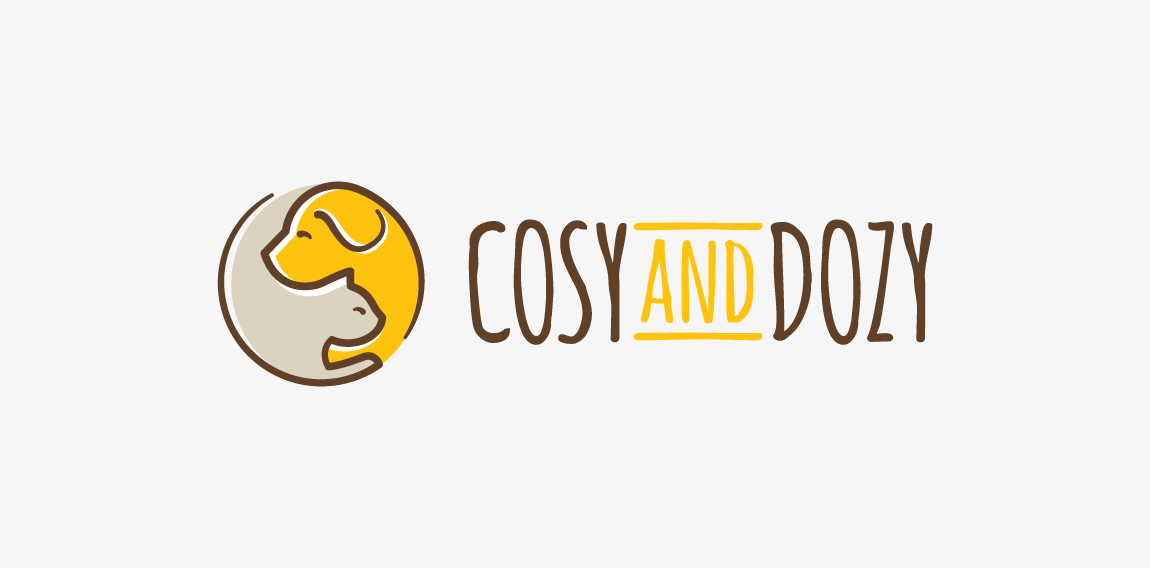
Logo design for cosyanddozy.com • • • Made for Motyf Studio.
Dutch IT company.
Talk

Rève is an design agency in Ho Chi Minh City, Vietnam. The logo is the combination of balloon(dream), dolphin(intelligent) and "R".
whaley logo
Custom letters created for marketing company. "K" letter has incorporated a rook/tower shape which refers to "protect the King" idea. • • • Follow us on www.instagram.com/triptic.pl
A logo for frozen yogurt store located in Hurghada, Egypt...