Water logos (111)
environmental advice and projects


An unused proposal for company selling fishing tools/accessories.


Logo of blog skippers.
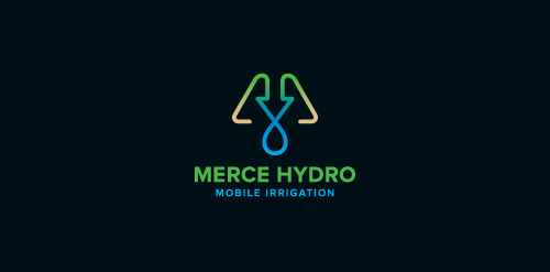
Merce Hydro, a mobile irrigation company based in Northern Victoria, Australia specialise in redevelopment of drought effected areas for the purpose of farming & residential properties. The Mark is based on the use of a water drop, an arrow, pipes & finished off with an M. The arrow symbolises function & the arrow/drop cross section symbolises design - both core factors in engineering & invention of their systems. Green represents growth, their aim. Brown represents destination (drought area) their market. Water represents sustainabilty, their long term plan, and finally the pipe represents management, their ongoing analysis & monitoring of their network.

Designer: Denis Aristov Client: Revitech Ltd. Iindustry: Water Supply and Sewerage Service Keywords: revival, technology, energy-saving, efficiency, service, lines, house, building, tree, leaf, sustainable, use, of, natural, resources, water, supply and sewerage, nature
made for fun but evolved from a serious project... :)
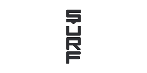
Surf Shirt

Unlock Your Creative Potential

This is another logo for the portfolio. It is a pity that only for a portfolio ...

mineral water
This is a logo for sale A minimal and professional logo. It can works for many business like, design studios, video games, video game clans, surf, jet ski company, and many more. More info at http://graphicriver.net/item/hunter-logo/634852?ref=cooledition
Cooperation between regions in the field of bioenergetics and energy transfer of knowledge. A project of Austria-Hungary Cross-Border Cooperation Programme 2007-2013 under the European Regional Development Fund, and Lower Austria, the province and the Republic of Hungary will be on display.
Another logo for the portfolio...
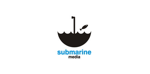
Logo for media company.