Typography logos (393)
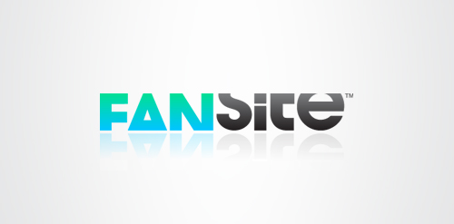
Fansite is a modern, digital equivalent of a fan scrapbook or fanzine; a social network for fans to get together, discuss and swap content based on their favourite celebrity. The typeface selected is modern and has a strong relevant personality itself, but it is treated in a unique way. Each letter is tightly cropped, yet still legible, inspired from old fanzines when fans would use scissors to cut and layout their magazines. This modern, digital equivalent creates a unique and memorable logotype.


Together
Surf Shirt
Typographic exploration.
Number 245
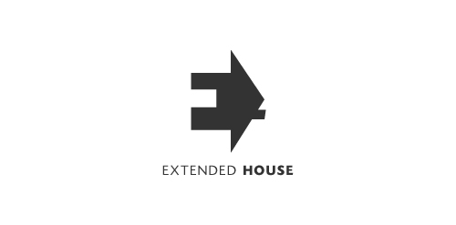
Extended House. Negative space used for the letter E. The house serves as a perspective to this letter E.
Redesign personal logo
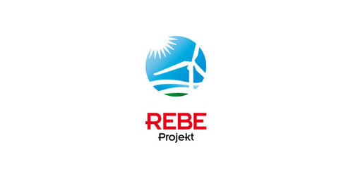
Cooperation between regions in the field of bioenergetics and energy transfer of knowledge. A project of Austria-Hungary Cross-Border Cooperation Programme 2007-2013 under the European Regional Development Fund, and Lower Austria, the province and the Republic of Hungary will be on display.
Unused logo proposal for ux / ui designer Alvin Thong
Title of my 2010 logo collection.

This logo is for a completely fictitious fish market.
The idea came to me when I discovered that it was possible to achieve a fish shape in the negative space within the bowl of the number 5. Dubbing my hypothetical company Pier 5 Fish Market, I created this very maximalist and illustrative mark in the hopes of really capturing the spirit of the nautical and maritime aesthetic. Type is custom for "Pier" and also the number 5, which is hand-rendered to look like it was painted on a wooden sign with a very wide, worn-out, thick-bristled brush. While it was important for the fish to show in negative space, it needed to look like a seemingly happenstance result of logical, real-world brush strokes. In the full lockup, the addition of the life preserver takes less emphasis off this gimmick, allowing one to slowly discover the fish.
Click here to see the case study for this logo, which chronicles its development, and includes full design rationale, sketches, electronic roughs, and alternate designs.
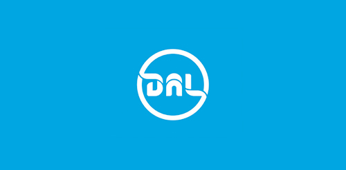
Proposal for a danish real estate broker. "Dal" is Danish for "valley". Custom typography.
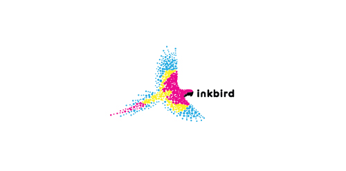
A bird made up of the colors cyan, magenta, yellow, and black to represent a printing company.