Typography logos (393)
Personal logo for me as a designer. The typography is just build from a simple half circle. The "W" can also be used as a standalone icon which is also a pair of eyes.


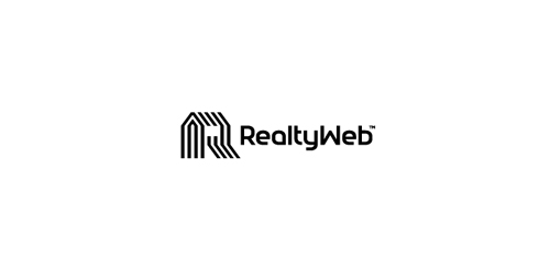
Approved logodesign for Realtyweb.com Custom made Typography. RealtyWeb.com combines 3rd party data and information on close to 30,000 state and local real estate markets to help the consumer and the real estate professional make educated decisions.
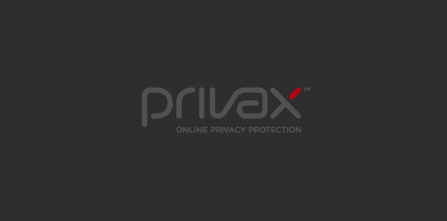
For a VPN Service (virtual private network) named Privax which helps secure your internet connection + helps protect your online anonymity through encryption. Custom made font. The concept: the x symbolize an abstract protective shield with which you surf anonymously, the red bar is the outside world / hacker etc...
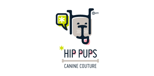
This fictitious company logo is the result of happenstance typographic exploration. I was playing around with H and I letterforms set in Platelet, and, after placing the I within the H, I noticed that it started to look like a dog face. After some modification, and with the addition of a curved P for an extended dog tongue, the resulting typographic illustration spelled "HIP." I thought it would be fun to name this fictitious company Hip Pups, which could be a shop that sells high-end dog accessories. The Registered symbol is integrated creatively into the mark by spelling "RUFF!"
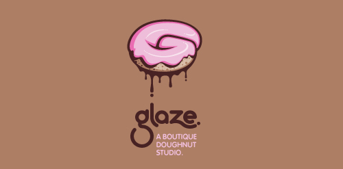
This is a totally fictional company that I refer to as "a boutique doughnut studio." I envision it as a trendy, metropolitan bakery that allows customers to glaze and decorate their own unique doughnuts. I wanted this to look really tactile, gooey, and sweet - like you really want to take a bite. Type for "glaze" is custom, and reflects the roundness of a doughnut. Click here to view my Flickr stream for full design rationale and additional images.
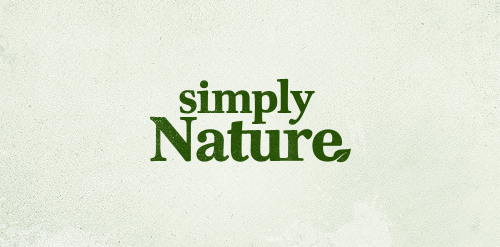
Logo proposal for a new client who is going to sell all sorts of natural health products through subscription based marketing
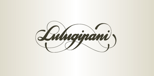
Logo Design for Sally Barrett, 2011.
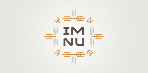
New logo concept for the barley & rye malt based drink »im nu«. See the process behind the custom type here: http://dl.dropbox.com/u/14259079/im_nu_process.png Big view including »Chocolate
Logo and type design for music label owned by Dutch singer Ilse DeLange.
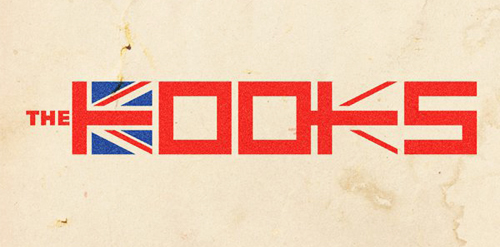
Just a draft idea for British band The Kooks as part of an international design competition that resulted in a second place for me.
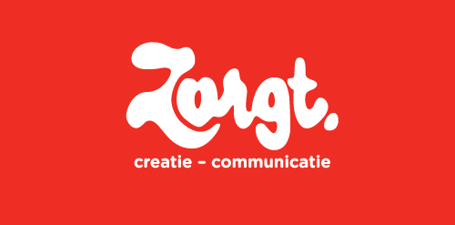
Completely handwritten logo type for Haarlem (The Netherlands) based communication agency. The letter 'o' consists of a subtile heart.
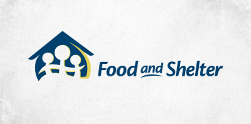
Logo for a non-profit company that helps families in need.
Logo for Jebin Wesley
Alternate logo for local fashion designer.
This logo was created as a personal brand mark for Geoff, to represent him as a graphic artist. This typographical solution was inspired by the 17th century Romaine du Roi, which features a serif face with its underlying structure. This mark was used previous to the Geoff Matheson Studio "G splat" and is no longer in use.