Typo logos (81)

Waterfall concept typo


Logo designed for a small fitness company from Scotland - Fitness Soul. Studio combines physical activity, fitness classes with dance. Great people!
Company specialising in design, production and worldwide distribution of music equipment.

Grebe concept typo
Custom type logo made for creative agency from Poland, Ostróda - Future Form. (personal project)
Logo for internet shop having products mainly made from wicker, wood and also another handmade stuff.

Podere principe della macchia, a new company of food products but most of all bee products.
The company in place at Santa Anastasia at the Feet of Mount Vesuvius where characteristic landscape of Naples, ancient and protected characterize the product in the selection and quality.
The brand wants to position itself predominantly in the range of products taste / quality and traditional products, the rediscovery of ancient flavors.
Objective.
the objective of the client was that of a logo that represents the company by projecting the old family coat of arms with its ancient values and traditions in our times.
I joined the old coat of arms of Caracciolo Rossi consists of a shield bendy gold and red to the head of blue.
This is the blazon that refers to the union of Charles bed (junior) that Gambacorta, Marquis of Celenza and Count of Macchia, in 1641 was awarded the title of Prince of Blur. He married Faustina Caracciolo, daughter of the Marquis of Brienza. Then I ran the whole thing in a modern and dynamic giving the shape of a shield that could drop drop indentificare precisely a drop of honey, and I worked on the various symbols of the coat of arms.

Sundial Concept Typo

drop concept typo

conceptual typo
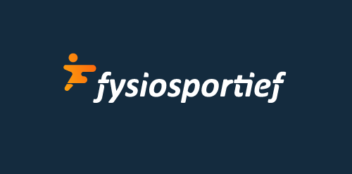
Logo design for a Dutch sport physiotherapy company called 'fysiosportief'. They asked me to come up with a new refreshing logo for their business. The client preferred the type to be custom and as friendly looking, easy to read and a little twist integrated in it that shows some sort of speed and dynamic. The icon is a combination with the letter 'F' together with a running human. Also tried to perfect the balance by adding that same shadow effect from the typo.
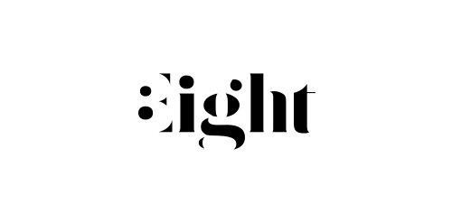
Expressive typography logo with negative number 8 hidden in the first letter.

Internet portal - daily dose of motivation and inspiration for your healthy body and mind. Strength, diet, self esteem. When designing typography for the word "fitcult" I was inspired by the characteristics of the fitness (muscle, power, energy, dynamic). Custom lettering is a specific high contrast between horizontal and vertical strokes. The letter "f" and "i" are connected to the ligatures.
Awesome identity for an awesome studio.

This is logo for website that is helping to correct typefaces, find names of fonts, etc.
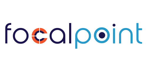
Logo design for an electrical and hardware shop called Focal Point

Design Carnivore
"yeah" like an ambigram.
Many don’t realize that each typeface we encounter in our day-to-day lives is a result of a very intricate creative process, that requires considerable effort on the part of it’s designer. Yet, the hallmark of any great typeface is humbleness: when you aren’t even aware of it while reading, then it’s good. That is the conflict I wish to resolve by raising awareness of the world of typography. I wish to pay my respect to the great masters by capturing their likeness in a series of portraits, composed of the very typefaces they brought into existence. Please take a moment to absorb these images and realize: in any great typeface, each and every letter is born of hours of care and effort, to people who really love their craft. László Sándor
Cathijane - custom typo logo for a web design studio