Real Estate logos (49)
A finance and real estate company dealing with high end property and business investments.


Exclusive Customizable Logo at http://wp.me/s4571j-overtop


Customizable Ready Made Logo Design at http://wp.me/p4571j-5a

Miodowa is the name of the residential estate at Miodowa street in Wroclaw. Miodowa is an adjective used to describe something that tastes like honey. That is why we join 3 themes in the logo: honeycomb, architectural design and letter M.
Designer: Piotr Ploch

Unused logo proposal

logo for the business card
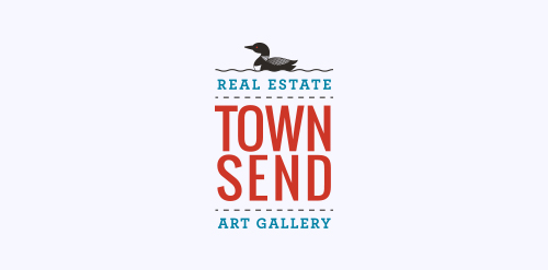
We recently completed this logo for Townsend Real Estate & Art Gallery in Maine. She wanted the logo to encompass the fresh coastal air of Southern Maine.

Logo for real estate

Logo for real estate
Logo designed as part of an identity for Johnson Modi Capital Ltd.

Real estate company for rental of commercial buildings
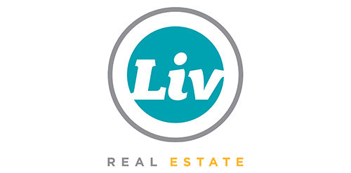
Urban Jungle was hired to develop Liv’s brand strategy, including its tagline and brand story. After clarifying its vision and defining its mission, values, personality, promise, experience, Urban Jungle then crafted the new corporate identity for the firm. The new look is simple, bold, and contemporary. It captures the essence of the firm’s fun and friendly personality while communicating its promise to help Edmontonians love where they live.

Sensimmo is a real estate broker for high quality homes.

Proposed concept for a real estate company. The mark has a crown in the center with the letter "M" being formed in the negative space.

The company rents apartments at Baltic Sea.

Real estate services
Logo proposal for client.

Sale of apartments in Prague

Logo design for a real estate company, U.S.A.