Orange logos (124)
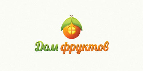
The shop of fruit and vegetables with home delivery. http://www.domfruktov.ru


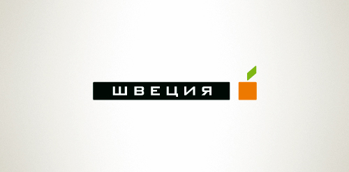
Designer: Denis Aristov Client: Sweden Group Industry: Advertising Agency Keywords: advertising agency, square, cube, apple, orange, green
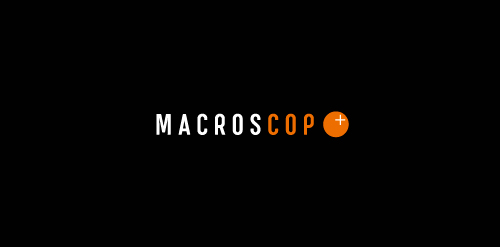
Designer: Denis Aristov Client: MacrosCop Industry: Monitoring & Guard Keywords: video, monitoring, guard, cop, sight, point, orange, black
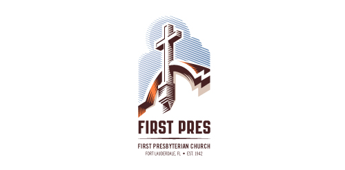
Redesign of the church's old logo in a stylized, illustrative manner, making it more welcoming, contemporary, friendly, casual, & upbeat. Client specified a rendering of the church’s architectural arch and cross in the perspective in this photo, and required an emphasis on the church's nickname, “First Pres."
Here, crisp, exacting vectors emphasize the architectural soundness of the church — a metaphor for the concept of faith as the solid foundation in one's life. This design makes use of hatching to add gradient dimensionality, enabling it to easily reduce down to 1-color. Colors are indicative of the building itself, including terracotta roof. Check my Flickr case study or Dribbble for more images, detail, and full design rationale.

Logo for a local software and app development company.

Zebra is a fictional charity that aims to help the conservation efforts for Zebras. The concept it clear, simple and respectful. Created as part of a genuine brief.

Private psychotherapy practice providing individual, couples, and family therapy.
The official logo used for The National Federation of Professional Trainers.

Logo for clothing company.

This logo is for a completely fictitious fish market.
The idea came to me when I discovered that it was possible to achieve a fish shape in the negative space within the bowl of the number 5. Dubbing my hypothetical company Pier 5 Fish Market, I created this very maximalist and illustrative mark in the hopes of really capturing the spirit of the nautical and maritime aesthetic. Type is custom for "Pier" and also the number 5, which is hand-rendered to look like it was painted on a wooden sign with a very wide, worn-out, thick-bristled brush. While it was important for the fish to show in negative space, it needed to look like a seemingly happenstance result of logical, real-world brush strokes. In the full lockup, the addition of the life preserver takes less emphasis off this gimmick, allowing one to slowly discover the fish.
Click here to see the case study for this logo, which chronicles its development, and includes full design rationale, sketches, electronic roughs, and alternate designs.

Q3 Marine Training Solutions

...
Binalogue is a cross-disciplinary design studio founded in Australia with established branches in America, Europe and Australia. Our steadily growing team is comprised of talented and passionate members from all corners of the world, constantly pushing their boundaries and looking at each project as uniquely challenging and fun.
With design as our starting point, we direct and develop creative content and communication solutions for a wide range of media, focusing on broadcast (network branding, motion graphics, vfx) and online (interactive design & development) platforms.
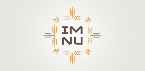
New logo concept for the barley & rye malt based drink »im nu«. See the process behind the custom type here: http://dl.dropbox.com/u/14259079/im_nu_process.png Big view including »Chocolate

..