
Medicine logos (30)
A logo for herbal based medicine factory


Meditalis (orthopedic aids)- logo.

A new logo for the medical massage practice in Switzerland. A practice which is spezialized in classic massage, heat therapy and trigger point massage.
Online Medicine Store, for suppliers, for customers.

Conceptual logo design showing a medical Caduceus and technology symbols combination. For sale.

Core School of Medicine http://www.coremedschool.com

https://www.behance.net/gallery/34442955/Spiritual-Wisdom-Americas «Spiritual Wisdom Americas nace en la Montaña Sagrada del Ausangate, Perú, en Julio 2011, en un viaje de búsqueda de visión, donde en cada paso hay un diálogo directo con la Sabiduría de la montaña y sus Guardianes»

https://www.behance.net/gallery/20834447/ARTE-Y-ALMA The Present brand 's strategic objective is to represent and communicate VIA visual signs UN Joint UN microemprendimiento Linked With The Environment and Health of the skin, Made with offering flowers , herbs , spices , rare oils , and Completely hand , sin Chemical preservatives . Broadcasting ASI art and Soul In Health Of Team . The beauty of women and men , constructed from elements of nature and spirit Mendoza . Thus was born The New Image Art and Soul " The Pleasure of the skin."

hospital and medical center

Plant-based local business.
PROJECT Panax Pharma is Czech based distributor of medicines and pharmaceuticals. I was asked to create simple and distinctive visual identity including logo manual and stationery. CONCEPT The logo contains stylized illustration of medicine mortar - traditional tool used for pharmaceuticals production and processing. The mark is reflecting susceptible and responsive approach of company through subtle rounded stylization and refined execution of it's design. Negative space used in illustration of the mortar also inspires emotions of preservation and processing content from out. Finally Optima typeface with turquoise and silver color palette completes company corporate identity design basics.

Ready made logo design.

Ready made logo design.
In brief, Abstraction is applied to the traditional "head figure" used in ENT field by using triangles as a visual presentation of the trio "Ear, Throat, and Nose" .

Vitamin supplements. Apple is incorporated as an abstract square to be more symbolic.

Company logo in selling medical equipment

Pharmabond are a new medicinal supply company in the US, deal with mostly bulk supply for private practices. The apple represents health; it is a continuous line with a loop implying ongoing health. The loop doubles as a droplet, to symbolise medicine, water, purification, etc. The leaf is also a subtle P. The blue enclosure is a protective seal to ensure ongoing health.

acupuncture clinic
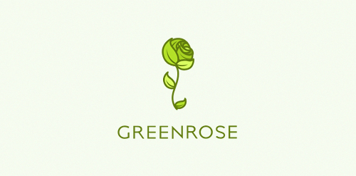
An eco friendly/fresh/green logo. Logos main accent is a green rose, that is made out of many leaves. Logo is still available.

Logo for a local dentist company.

Designer: Denis Aristov Client: «Пермский краевой перинатальный центр»(The Perinatal Center of Perm Region) Keywords: Perm, perinatal, center, hospital, clinic, medicine, baby, head, flowers, Children are flowers of life