Logotype logos (313)

https://www.behance.net/gallery/7975715/Polleria-Suprema (Supreme, an essential part of the chicken that manages to draw the two sides on the side of the chicken breast skeleton. The brisket. Each of them open with a knife carefully, since the meat is very delicate, it flattens. They are ideal for them with a variety of fillings, rolled and cooked as a stiff, or make patties and other foods.)


https://www.behance.net/gallery/20834447/ARTE-Y-ALMA The Present brand 's strategic objective is to represent and communicate VIA visual signs UN Joint UN microemprendimiento Linked With The Environment and Health of the skin, Made with offering flowers , herbs , spices , rare oils , and Completely hand , sin Chemical preservatives . Broadcasting ASI art and Soul In Health Of Team . The beauty of women and men , constructed from elements of nature and spirit Mendoza . Thus was born The New Image Art and Soul " The Pleasure of the skin."

Nugno is a company that was formed when two compatible and creative individuals – Luca & El – came together. Grafting in collaboration, the pair multiply the excellence of their work, producing result- and experience-driven work. Their mission was to design an identity to define a distinct brand style that communicated the core values at the heart of the business – passion and creative brilliance. The final design combined a minimal typographic aesthetic and simple colour palette to create a distinctive visual identity communicating the purity of their style.
Unused idea for insurance company.

STAIRS

The logo idea for a company, which deals with business tourism in China, providing logistics services, assistance in finding suppliers and cargo declaration.

London based financial/capital company - approved version.
Logotype for the civic association Hafira (blueberry).
logo for The Horror Hotel quest – is a reality game
Playing with name & letters.

Just for fun. Any comments are welcomed! :)
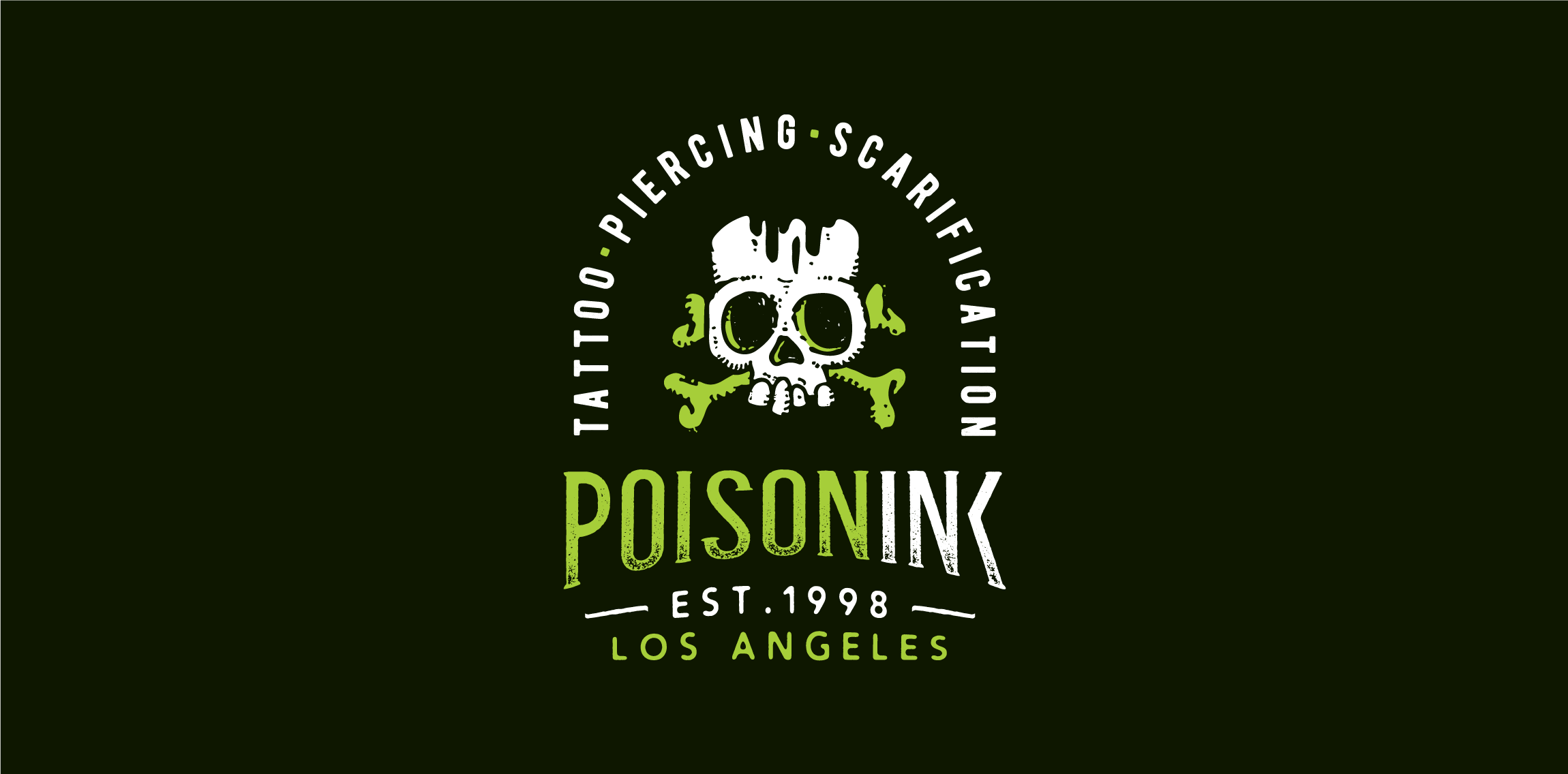
Playing around the naming, drawing & typography: Poisoning + Ink = POISONINK Dabum tsssssss!
Logotype for social media mobile app.
Logotype for a Travel Agency based in Japan & Croatia.
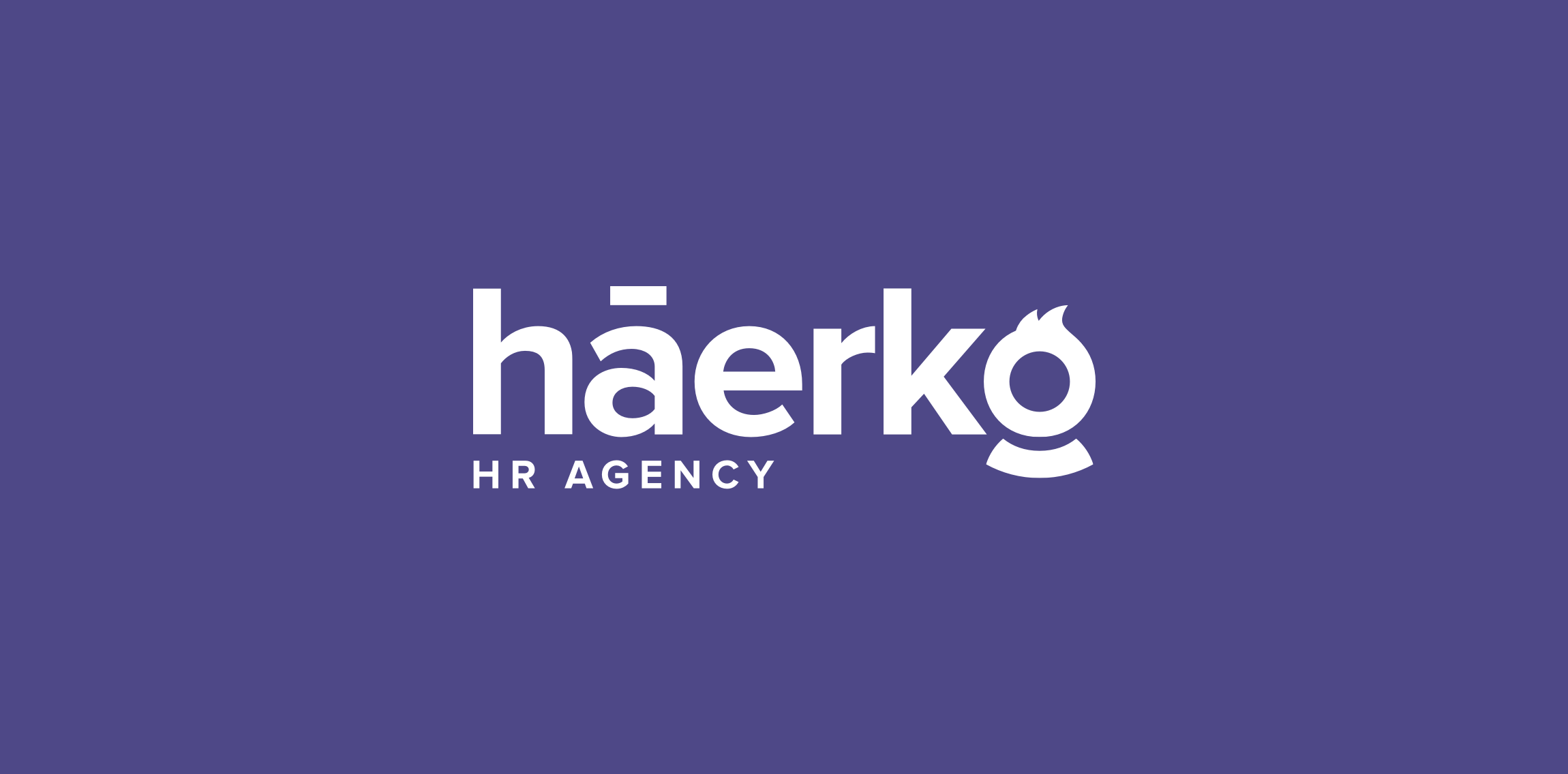
Hi everyone! My latest logo design for háerko - HR Agency. The point is the hidden men/women at the end of the logo. To be fair, I made multi-sex versions :) Check full version on my dribbble: http://bit.ly/1R8fp9v

Wordmark crafted for developer of interactive solutions. • • • Follow us on www.instagram.com/triptic.pl

New work is here! Branding and packaging design for a Swiss cosmetic line-up. Check full case study in my portfolio. www.dominikpacholczyk.com
One of the brand marks I’ve done at the end 2015. „N” for clothing company from Chile. // www.dominikpacholczyk.com
Just playing around the naming and custom letters. Follow us on www.instagram.com/triptic.pl

Branding project for Fil (English: 'elephant'), an Istanbul based atelier that produces handmade ceramic goods.
Logo for a website that selling gifts online. All the gifts will include preserved flowers in the boxes. I incorporate 'v' with a 'rose' to represent this brand and the client love it. :)
Logo idea rejected by client. It is an unused proposal for a media-related company and now it's for sale.