Logo logos (1957)

https://www.behance.net/gallery/16906829/Teaura This brand has a strategic objective to represent and communicate through a set of visual signs, quality, simplicity and modernity; predominant modulation of their strokes and endings. Tea Leaf: The leaf or bud tea plant is essential to our identity, which is a more representative and traditional element. Source: strokes and terminations Chinese signs were taken into account to make the brand Tèaura as the Tea originally comes from China.


https://www.behance.net/gallery/40556041/Interespacio- INTERESPACIO: based on the characters of (I)nterior and (E)spacio + celosia. The study came from Mexico. Three years ago, as first instance began with interior design and architecture, then we got and started working professionally. Throughout the time we moved to Argentina and the idea of opening our own trade and professional studio. We needed a nice, comfortable place for people to know us a little more and we could show our knowledge in: products and services


https://www.behance.net/gallery/7975715/Polleria-Suprema (Supreme, an essential part of the chicken that manages to draw the two sides on the side of the chicken breast skeleton. The brisket. Each of them open with a knife carefully, since the meat is very delicate, it flattens. They are ideal for them with a variety of fillings, rolled and cooked as a stiff, or make patties and other foods.)
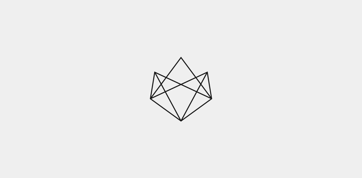
Geometry forms exploration. // www.pacholczyk.co

https://www.behance.net/gallery/20834447/ARTE-Y-ALMA The Present brand 's strategic objective is to represent and communicate VIA visual signs UN Joint UN microemprendimiento Linked With The Environment and Health of the skin, Made with offering flowers , herbs , spices , rare oils , and Completely hand , sin Chemical preservatives . Broadcasting ASI art and Soul In Health Of Team . The beauty of women and men , constructed from elements of nature and spirit Mendoza . Thus was born The New Image Art and Soul " The Pleasure of the skin."

Logo for school of programmers.

logo for a real estate consortium based in mexico.
App for creating connected City using Bluetooth Low Energy
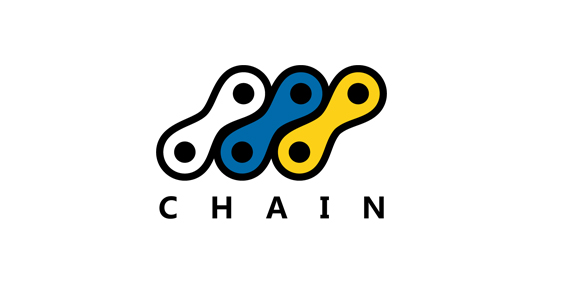
Chain logo foro a bicycle store! Feedback and support appreciated!

logo for an art gallery based in mexico.

Nugno is a company that was formed when two compatible and creative individuals – Luca & El – came together. Grafting in collaboration, the pair multiply the excellence of their work, producing result- and experience-driven work. Their mission was to design an identity to define a distinct brand style that communicated the core values at the heart of the business – passion and creative brilliance. The final design combined a minimal typographic aesthetic and simple colour palette to create a distinctive visual identity communicating the purity of their style.

During the holidays I had an idea to draw a lion symbol. I tried not to complicate the shapes, the result went better after so many attempts.
Stone sheep ram logo design. Unused logo mark.

...

Modern Auto parts company, please check out the full project

Men SPA logo

...
Logo Design for Resort
Another logo for horse

Unused idea for insurance company.