Letter logos (116)
This logo is shaped as a letter G and is suitable for any freelancer, business or service that is modern and wants to stand out. The icon is very recognizable and unique. If you want to buy this logo, it is for sale at SuitableLogos.com


Victoria is a financial fund based in Warsaw. The key was to combine a eagle (symbol of Poland) and V letter (for Victoria). There were several concepts - some modern, some classic, more decorative with a pinch of victorian styling.


Sunny Wines is a small wine importer from Warsaw/Poland. The aim was to combine letters SW with wine symbols like grapes or cork screw, but the client wanted to see also more elegant symbol combining those letters.

Sunny Wines is a small wine importer from Warsaw/Poland. The aim was to combine letters SW with wine symbols like grapes or cork screw, but the client wanted to see also more elegant symbol combining those letters.

Sunny Wines is a small wine importer from Warsaw/Poland. The aim was to combine letters SW with wine symbols like grapes or cork screw, but the client wanted to see also more elegant symbol combining those letters.

Victoria is a financial fund based in Warsaw. The key was to combine a eagle (symbol of Poland) and V letter (for Victoria). There were several concepts - some modern, some classic, more decorative with a pinch of victorian styling.

Qualitalia is a Italian language school based in Warsaw/Poland. We combined letter Q with colloseo and italian flag.

Sunny Wines is a small wine importer from Warsaw/Poland. The aim was to combine letters SW with wine symbols like grapes or cork screw, but the client wanted to see also more elegant symbol combining those letters.

Victoria is a financial fund based in Warsaw. The key was to combine a eagle (symbol of Poland) and V letter (for Victoria). There were several concepts - some modern, some classic, more decorative with a pinch of victorian styling.

Victoria is a financial fund based in Warsaw. The key was to combine a eagle (symbol of Poland) and V letter (for Victoria). There were several concepts - some modern, some classic, more decorative with a pinch of victorian styling.

aarto is a small architecture design studio based in Warsaw/Poland. The aim was to diffirentiate 3 areas of expertise: Architecture - Urban planning - Interior design. We wanted to keep it simple and modern.
Logo

I letter-mark
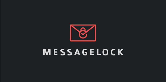
Message lock is an email security company selling encryption software forward cellular devices. The name of the company reflects the kind of service they provide, so had the symbol, taking a minimalist approach the solution represent a lock that's encloses on a letter being the email making it protected, secured and unbroken.
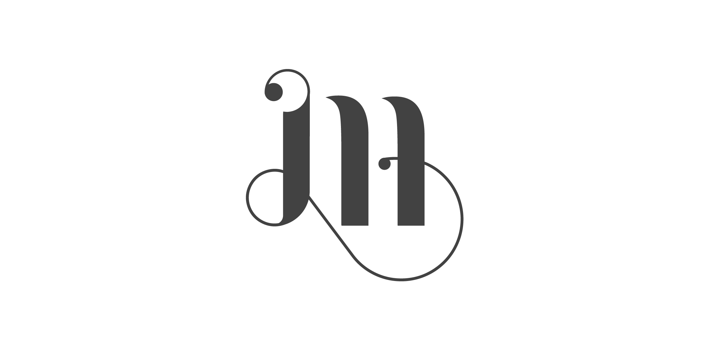
My inspiration for this has been calligraphy, something I got into in the last few months. My initial (M) has been made with a typographic technique, using elements common in calligraphy. Feel free to comment my work and don't forget to appreciate if you like it :)

A lightning bolt is formed in the negative space of the letter C.

Purple

Guess who's tired from standing since the day it was discovered :)

Mail King
GENERAL CONSULTING
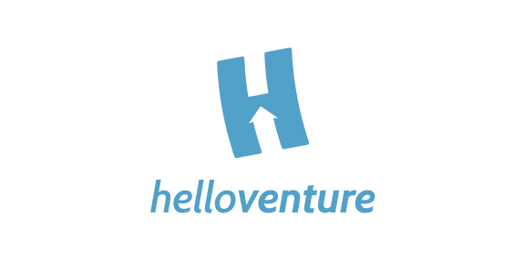
Hello Venture is an organisation that brings start-up communities together and creates spaces for entrepreneurs to learn and work. In this case, the brand identity that we created focuses on the letter H with an arrow inside to symbolise the progressive growing of the new enterprises. The H is flying up. The logotype is set in lowercase letters to emphasise the company’s humble and friendly approach. The colour scheme represents security and confidence. The result is a minimalist identity with customised typeface and flexible print material.

"Beastie" logo design for sensual quality products for manufacturing company in China.

A very simple logo design for happy co. Instead of putting a straight line below the CO part, i've made a smile, because its happy.