Identity logos (237)

The landscape gardeners build as much as they plant, summed up in a marque made of both a garden trowel and leaf.


Titan Elevators needed a rebrand to showcase their offer. The logo was right under your nose; the up and down arrows of an elevator, simply made from the logotype's A and V.

Bruce & Co is a Scottish private bank with a solid reputation of having good foresight and future planning. The lion marque derives from Scotland's oldest clan- the Bruce Clan, with the motto 'fuimus' (we have seen).
Logo for a Television Agency (+pr)

Logo for a culinary blog.
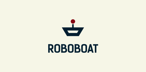
Fully robotized boats
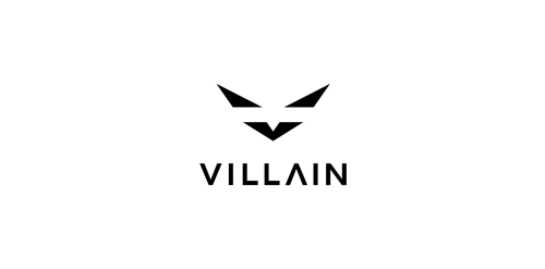
Streetwear company
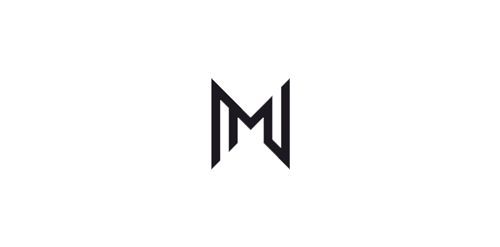
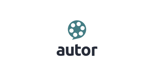
My personal mark, a combination of my initials - MN

Believing what a mechanic is telling you is always a stretch. But Lewis Lawrence insisted he was good and honest. The mechanic's marque doubles as a spanner and an honest mechanic in overalls, hands held comfortably behind his waist.

Logo for a traditional Turkish coffee-house chain. Looking for an item I noticed the traditional Turkish Fez (turkish hat) in the form of a truncated cone which flipped will guide our mind to a cup of coffee. Along with this unmistakable Turkish element, Turkish mustache is part of the image of this nation too. Combining these two elements the graphic logo was born.

Logo of the restaurant and winery located in Warsaw. Colors from wine and interior design of local.

Swurl Wine is elegant wine company looking to re introduce their brand and expand in various flavors. I wanted to emphasize on the idea of swurl and execute an imagery that represent that word itself. Playing with the negative space and open concept, I created a minimal yet surreal identity.

Brand identity for Copper Bird Cafe
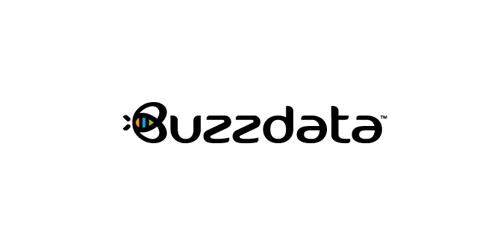
BuzzData is a social platform/network where you can publish and discuss data. BuzzData lets you publish your data in a smarter, easier way. It's about data and a part of it to visualize the information. You can attach articles, visualizations, apps and even source code... etc. www.buzzdata.com Identity solution: A custom made uniqe Typography with a varying thickness shows buzz and motion. The front letter "B"ee can also be used as a standalone favicon which is very important for a social network company since it is easier to incorporate it in very small sizes around the web for buttons and links. The Bee has a uniqe shape, is very memorable and iconic. The colors which are used into the negative space of the bee are resembling the companies main product >data< which comes from the social network users in unlimited variations... everyone can publish and discuss data. The color forms are reminiscent of chart bars, pies (statistics).

For a local anesthesiologist team in the ulm. They wanted the town's landmark incorporated somehow in the logo. The Minister of ulm is the tallest church in the world. For those who don't know the landmark of ulm follow this link for more information: http://en.wikipedia.org/wiki/Ulm_Minster

Colourful Days (Chromatistes Meres) is a company active in the field of experiential education, with programs for children as well as training seminars for adults. The programmes, divided in thematic circles are designed by specialist educators – animators, and cover a variety of educational and entertainment-related subjects. The target is the high quality of the end result. Every programme is experiential as well as educational. Built around theatrical games, it accomplishes its target through games, constructions and a lot of imagination, providing to children the opportunity to play, to express themselves and to create. The logo, inspired by the ‘circles’ of the programmes has been designed so as to express joy, playing, movement through a mosaic of colours and experiences

Brand identity for Line Digital
Self logo and identity of my face.

Logo design for a company, focussing on saving water and energy, based in Belgium.

Self identity, custom typeface.