Dog logos (72)
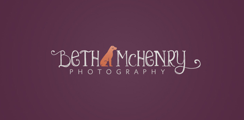
A brand new photography business specializing in dog photography.


Aksai Children's Clinical Hospital

Logo for a weimaraners

First letter of first two words of the name - letter "M" made using pet silhouettes. Unused concept.

Done for fun
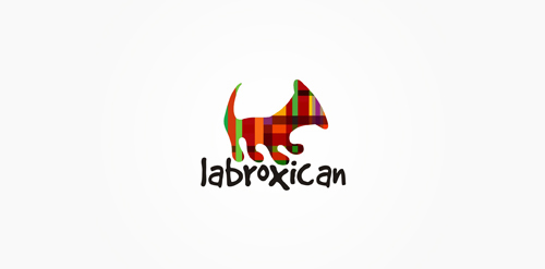
Mexican records label. Labroxican = Labr(ador) + (b)ox(er) + (mex)ican. Mexican style pattern over dog + gramophone silhouette.
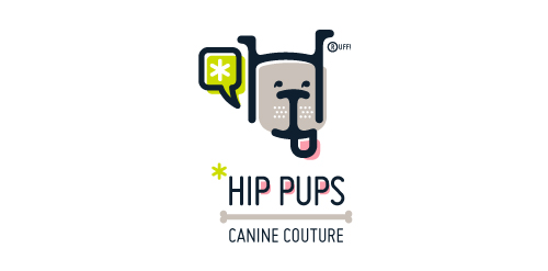
This fictitious company logo is the result of happenstance typographic exploration. I was playing around with H and I letterforms set in Platelet, and, after placing the I within the H, I noticed that it started to look like a dog face. After some modification, and with the addition of a curved P for an extended dog tongue, the resulting typographic illustration spelled "HIP." I thought it would be fun to name this fictitious company Hip Pups, which could be a shop that sells high-end dog accessories. The Registered symbol is integrated creatively into the mark by spelling "RUFF!"

...

The client wanted a logo that communicate the love that their puppies are given and they also wanted to talk about their home where they used to have their shop.

Unused concept for client. I used the negative space to make the cross between both dogs. And I made a custom font for the text.

Logo for a dog grooming parlor
logo done just for fun

The good life! .. logo inspired by the beautiful Roman life of the '50s and '60s as the famous Fellini film. To make the logo a lot of fun and interesting I put a dog on the famous Vespa, a symbol of those years. The logo sums up the light-heartedness and joy, with a very humorous tone, in those years logo suitable for all business-like look and inspire joy in their brand

Logo for a pet store which combines a dog and parrot.

Logo on the package

SailDog - SailDog yacht club. The logo with the dog. His idea is to convey the mood of the club, to show how happy people meet here. The logo shows a dog sticking his head over the side of a boat with his tongue out. its funny, simple, and exclusive.