Custom logos (71)

Urban Jungle designed the Burkinshaw Law Group corporate identity. The subdued identity was inspired by Olde England and grounded upon the firm’s core values of wisdom, service, and goodwill. It incorporates a completely customized font treatment based off the Clarendon typeface.


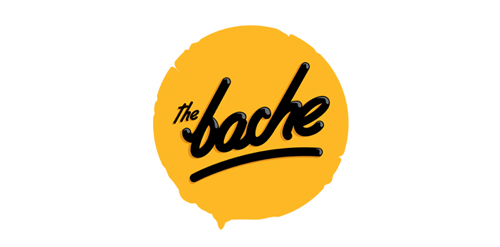
The Bache is the name of own small business in video productions and graphic design. It is pronounced as ‘The Badzje'. Little shameless self-promotion right here: www.thebache.nl

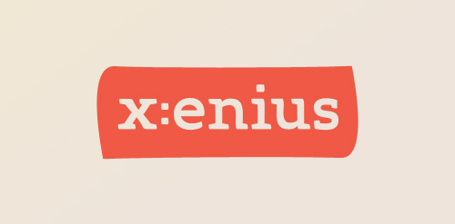
Custom logo as part of a design study of the TV program 'x:enius' running on arte. Detail: http://dribbble.com/shots/396196-x-enius/attachments/21789
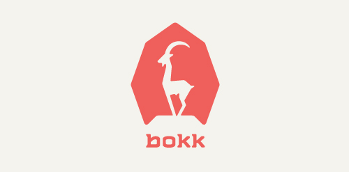
I recently realized I've never designed anything animal related. So I decided to give it a try with this ibex. The logotype was custom made and incorporates characteristics of the ibex. (The name bokk is derived from the word sprinbok.)
Cathijane - custom typo logo for a web design studio

a logo made for my own project - custom type.

My second custom typo. For my lovely girlfriend :)

Logo idea for a coffee shop. Custom font

Vesea logotype

This logo is for a completely fictitious fish market.
The idea came to me when I discovered that it was possible to achieve a fish shape in the negative space within the bowl of the number 5. Dubbing my hypothetical company Pier 5 Fish Market, I created this very maximalist and illustrative mark in the hopes of really capturing the spirit of the nautical and maritime aesthetic. Type is custom for "Pier" and also the number 5, which is hand-rendered to look like it was painted on a wooden sign with a very wide, worn-out, thick-bristled brush. While it was important for the fish to show in negative space, it needed to look like a seemingly happenstance result of logical, real-world brush strokes. In the full lockup, the addition of the life preserver takes less emphasis off this gimmick, allowing one to slowly discover the fish.
Click here to see the case study for this logo, which chronicles its development, and includes full design rationale, sketches, electronic roughs, and alternate designs.
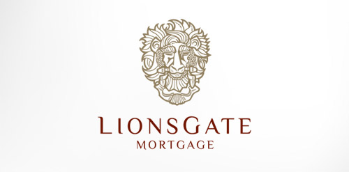
Antique, ornate, brass lion head door knocker logo for a growing and expanding mortgage company that wanted a new look, name, brand and image for their company. The brass knocker represents the entry way into the threshold of the home and the comfort a home signifies.
Logo for my art & design studio.
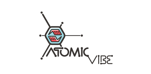
I define ATOMICvibe as the "a-HA!" moment of clarity in the creative process. Like nuclear fusion, it's when tiny ideas coalesce, and then explode into beautiful design.
The logo visually depicts this creative reaction. Forming abstract A & V shapes, the converging hands cradle the tiny beginnings of a big idea, fusing them until they discharge a shockwave of creativity. The custom type, designed to perfectly integrate with the mark, is meant to symbolize electron paths. Heavily inspired by retro imagery from the Atomic Age: science, the Space Race, Sputnik, the iconic George Nelson Ball Clock.
Click here to see the case study for this logo, which chronicles its development, and includes full design rationale, sketches, electronic roughs, and alternate designs.
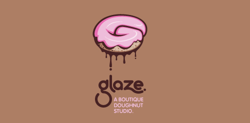
This is a totally fictional company that I refer to as "a boutique doughnut studio." I envision it as a trendy, metropolitan bakery that allows customers to glaze and decorate their own unique doughnuts. I wanted this to look really tactile, gooey, and sweet - like you really want to take a bite. Type for "glaze" is custom, and reflects the roundness of a doughnut. Click here to view my Flickr stream for full design rationale and additional images.
Just a draft idea for British band The Kooks as part of an international design competition that resulted in a second place for me.
Completely handwritten logo type for Haarlem (The Netherlands) based communication agency. The letter 'o' consists of a subtile heart.
Marketing agency. Selected proposal. It turned out that the most important thing for the client was the impression of experience, seriousness, stability and ability to take on the most demanding jobs. Custom made lettering was a big part of why they have decided to go with this design.
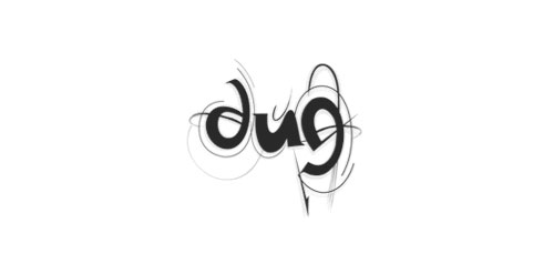
DUG (dans uten grenser) trsl. "dance without limits) A dance organisation which focuses on attracting youths to the dancefloor. By targeting all youths the goal is to make dance interesting, cool and including