Creative logos (278)
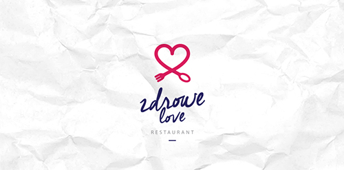
Zdrowe Love Restaurant. Restaurant with a healthy and natural food.


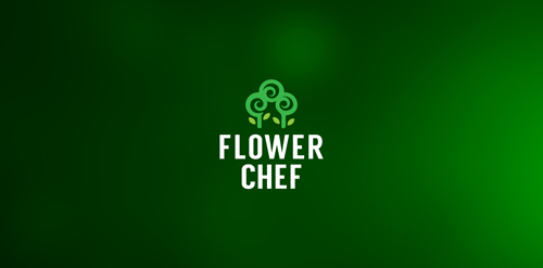
Flower Chef - Great online flower shop. Florist owners describe themselves as master chefs in the flower industry ;)
Rabbit Loves Carrot - https://dribbble.com/Aditya-Chhatrala
Creative logo.

Logo designed for a Restaurant in Caracas, Venezuela
Custom type logo made for creative agency from Poland, Ostróda - Future Form. (personal project)

Podere principe della macchia, a new company of food products but most of all bee products.
The company in place at Santa Anastasia at the Feet of Mount Vesuvius where characteristic landscape of Naples, ancient and protected characterize the product in the selection and quality.
The brand wants to position itself predominantly in the range of products taste / quality and traditional products, the rediscovery of ancient flavors.
Objective.
the objective of the client was that of a logo that represents the company by projecting the old family coat of arms with its ancient values and traditions in our times.
I joined the old coat of arms of Caracciolo Rossi consists of a shield bendy gold and red to the head of blue.
This is the blazon that refers to the union of Charles bed (junior) that Gambacorta, Marquis of Celenza and Count of Macchia, in 1641 was awarded the title of Prince of Blur. He married Faustina Caracciolo, daughter of the Marquis of Brienza. Then I ran the whole thing in a modern and dynamic giving the shape of a shield that could drop drop indentificare precisely a drop of honey, and I worked on the various symbols of the coat of arms.
A creatively simple logo.
First Letter Of Oceanic co.
Simple chameleon logo. Full presentation here - http://graphicriver.net/item/chameleon-logo-template/9317280

Restyle for a young agency
The signet of the Corporate Design for a Kindergarden that is supported by the evangelic church. The Kindergarden is famous for being located in the middle of fields and green hills.

Cognitive logo developed for Casablanca creative agency. www.behance.net/gallery/20264157/Casablanca-Branding
This was a commission we received from a company called Omnistaff - A recruitment Agency based in Johannesburg, South Africa. The company required a minimal logo that signified the multilateral approach they had to staffing solutions. This logo makes use of clever negative space to create the N, which just so happens to look like two arrows pointing in different directions.
beauty centre & spa
InBest&Co (Financial Services) - (MEX)
Ideal for creative designs, media and entertainment and modern arts.
Simple and easy to remember logo design. The lowercase letter g represents the head of an elephant. Ideal for multi-media, creative designs and eco-friendly company.
A cartoon logo designed for a movie making company.