Creative logos (278)
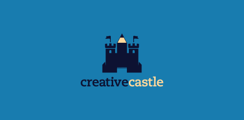
Logo proposal for a webdesign agency. Inspiration: a castle which instead of a middle tower has a pen pointing up.


A logo for a new artist commerce community

Creative Agency in Russia.
- Consulting on foreign investment in Ukraine support investment processes - Energy projects based on the theme of green energy, solar, wind, biomass - Woodworking, wood processing factory with export to the West
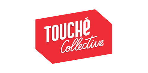
Touché Collective is a young creative collective from The Netherlands. Check them out at www.touchecollective.com
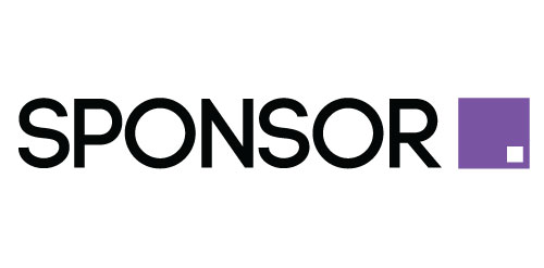
For SponsorSquare.com, nice clean modern logo with a clean square graphic representing and replacing the word square
You can now view this logo animated by the brilliant Dan Johnson of 'spin my logo' www.vimeo.com/47336194
The concept is based of my ideation process. The dynamite represents the initial spark of an idea, while the pencil relates to the creative result.
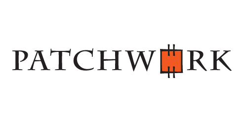
PATCHWORK is a logo that represents the art of making great designs from basic shapes pieced together so that 1+1>2. It has the perfect eye-catcher - a colourful "patch" combined with a typeface that looks as if sewn. These match to create a strong and memorable logo.
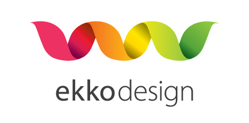
A logo for a webdesign business in Norway. "Ekko" means echo. Clean, simple and elegant logo.
Bright and colourful, a logo that represents colour, energy and youth.

A logo about colour! Deep, vibrant and colourful.

Creative Pictures project another rebrand approach this time with directors tube.