

Clever logos (133)

Logo design for professional wedding photography company capturing creative wedding photos.

 0Dec-06-11

Logo for a company that provides solutions and apps for facebook, iPhone, android and other platforms.
 8Nov-13-11
Unused logo proposal for ux / ui designer Alvin Thong
1Nov-02-11
This logo is for a completely fictitious fish market.
The idea came to me when I discovered that it was possible to achieve a fish shape in the negative space within the bowl of the number 5. Dubbing my hypothetical company Pier 5 Fish Market, I created this very maximalist and illustrative mark in the hopes of really capturing the spirit of the nautical and maritime aesthetic. Type is custom for "Pier" and also the number 5, which is hand-rendered to look like it was painted on a wooden sign with a very wide, worn-out, thick-bristled brush. While it was important for the fish to show in negative space, it needed to look like a seemingly happenstance result of logical, real-world brush strokes. In the full lockup, the addition of the life preserver takes less emphasis off this gimmick, allowing one to slowly discover the fish.
Click here to see the case study for this logo, which chronicles its development, and includes full design rationale, sketches, electronic roughs, and alternate designs.
 0Oct-08-11
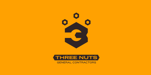
This logo is for a completely fictitious entity named Three Nuts General Contractors.
The idea for this brand came to me when I was out and about in the world, and saw a contractor's work van drive by. As I looked at the number 3 in the telephone number on the van, I started thinking about how a cleverly constructed 3 could reveal a wrench in negative space.
Using a hexagonal bolt nut as my main source of inspiration, I thought of a whimsical name which would support the concept I had in mind. In this hypothetical situation, the "Three Nuts" could be a team of three general contractors.
The icon is built from the angles of the bolt nut, and the entire mark should evoke a heavy industrial feel; something that could be stamped into metal, etched into wood, or simply affixed on the side of a work van.
Click here to see the case study for this logo, which chronicles its development, and includes full design rationale, sketches, electronic roughs, and alternate designs.
0Sep-18-11
Logo proposal for a new client who is going to sell all sorts of natural health products through subscription based marketing
0Aug-30-11
.
 16Jul-19-11
?
 2Jun-03-11
Swan act...
0Jun-02-11
"E-sun" is a sunny brand.
2May-13-11
Mr. Zoom is a positive brand.
2May-10-11
The logo has two elements: "IQ=0" and "10=0"
0Apr-27-11
Name has two elements: the word "AIR" and airplane.
0Apr-21-11