
Australia logos (12)
Logo process and branding: https://www.behance.net/gallery/31767063/Peaceful-Bay-Logo-Branding A wine company requested a logo that would represent Peaceful Bay a region located in a South -West Australia. Doing some research, I found out that whales visit the southern Ocean, a great symbol for the label and name. After multiple sketches this is the final result.


Sneakz is an Australian based sneaker shop. we use two shoelaces on the logotype.

Logo design for "FITTLE" - fittle.me This logo idea presents dual meaning - HEART and CHECK MARK symbol. The logo presents the joy of healthy achievements and exciting lifestyle. "FITTLE" aims to bring together health professionals and clients from around Australia.

a cute colorful and funny rabbit (bilby) for Australia illustration

The AUthentic logo design resembles the map of Australia. It presents a strongly formed approach suitable in the coffee roasting industry. With this new brand name, you can establish new position in the coffee industry.

Australia's best yoghurt sells what it says. The design reads the letters ABY as well as a yummy expression.
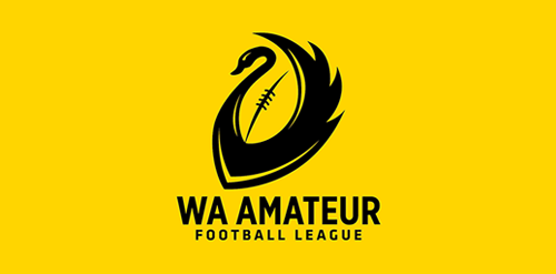
The new logo for the community Australian Rules football competition in the metropolitan area of Perth, Western Australia, the client needed a redesign using a black swan so i came out with the idea of using a football as negative space.

Unused proposal. The logo shows a tree in the shape of Australia.

Logo is a simplified ink splash, kangaroo and Australian map.

This concept is based around a simple typographical focus on the RSSA acronym. The Society’s diverse scientific interests helped to form this visual approach, ie deliberately avoiding reference to any particular field with a recognisable visual. The intention was to provide a current day sensibility regarding identity design and construction, in combination with more traditional styling for a long established scientific body. To aid this desire, a modern serif was chosen as the primary font and a secondary sans serif for the tagline versions. These fonts were chosen as a combination for their ability to convey this future/past feel. The icon structure has the added effect of allowing the reading of ‘RS’ & ‘SA’ in either direction, and utilises the Society’s formation date within the design, as it adds historical weight and relevance, plus is also a small visual indicator regarding who and what the RSSA represents.