Architecture logos (52)
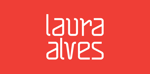
"The project for Architect and Urban Planner Laura Alves was based on the abstract forms and drafts used on a daily basis of the architect. We used orange as a color base because it inspires creativity."


"Project developed for the architect Fabricia Cortina, where the inspiration for the brand development was based on the French Curve ruler, an important element of Architecture.”

lofo for contest For achitectural construction
In the Banat village of Mokrin, in the far north-east of Serbia, on the estate known as the House on the Flat Hill, for the last three years a peculiar creative center is coming to life - a unique meeting point of arts, education, design, social and technological innovation, traditional craftsmanship and cultural industries... This unique multi-functional complex is designed to provide an inspiring environment for collaborative work of artists, scientists, designers, researchers and professionals from a wide range of disciplines. Through the transformation of the abondoned estate into an multi-functional innovation complex, the House on the Flat Hill is converted into House of Ideas. The project was executed for the purpose of Branding the new HOUSE OF IDEAS in the Banat village, Brochure, Ipad application, logotype & branding was following the new aesthetics. The architectural studio AUTORI for the past three years they have been working on the execution of the new and reconstructed buildings on the House on the Flat Hill estate, in collaboration with Terra Panonica. The House on the Flat Hill as the House of Ideas continues to be a meeting place of creative people from a variety of disciplines - from business to culture and arts - who are invited to realize their ideas in various forms, or to take part in the programs that House of Ideas will be organizing. - See more at: http://www.vsumic.com
Logo for the studio of architecture and interior design
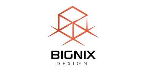
Bignix Design is a logo design concept for architectural firms aiming to promote a minimalist yet powerful image of their business.

It's a logo inspired by a famous fort called 'Hissar Fort' in Tajikistan.
Proposal for Logo of an architecture agency.

Architecture & Design studio

Union Of Moscow Architects

As an architectural enthusiast, my architectural manifesto explores the synthesis of life in materialized form. It is the agglomeration of ideas being in a phenomenological context. Inventive approach drives me intuitively into uncovering unexpected branches as illustrated in the representation. Golden ratio is employed to invigilate the actualization of the notion.

Unused proposal for an interior design group.

Logo for an interior decoration brand. Made of cushions!

Architecture and design studio
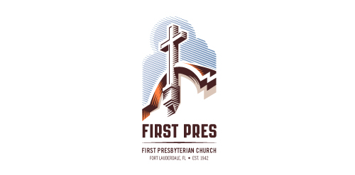
Redesign of the church's old logo in a stylized, illustrative manner, making it more welcoming, contemporary, friendly, casual, & upbeat. Client specified a rendering of the church’s architectural arch and cross in the perspective in this photo, and required an emphasis on the church's nickname, “First Pres."
Here, crisp, exacting vectors emphasize the architectural soundness of the church — a metaphor for the concept of faith as the solid foundation in one's life. This design makes use of hatching to add gradient dimensionality, enabling it to easily reduce down to 1-color. Colors are indicative of the building itself, including terracotta roof. Check my Flickr case study or Dribbble for more images, detail, and full design rationale.
Architecture department at Białystok University of Technology. Description: simple, easy to remember and draw sign. Symbolical reference to steel bridges span, construction, modular grid. Including W&A letters. ("Wydział Architektury" Architecture Department). Symbolical imaging of 3 parts/triangles as 3 faculties: - architecture & town-planning, Interior architecture, Graphic design

project organization
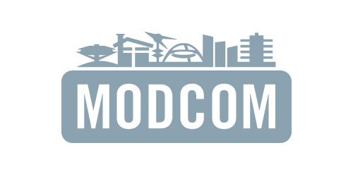
Los Angeles Conservancy's Modern Committee (Modcom) preserves modern architecture in Los Angeles
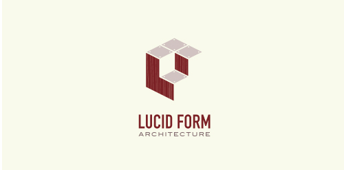
This logo is for a completely fictitious architecture studio called Lucid Form Architecture.
The icon is based on an optical illusion of a cube within a cube. Primarily, the form depicts a big cube, made of wood walls and metal-plated top surfaces, with a notch cut out of the center, resulting in a 3-D "L" shape. However, the longer one looks at this, perception begins to shift, resulting in a couple of different interpretations: 1) a small cube with a wooden wall and metal-plated bottom, in the corner of a room, hovering near the top of a tiled ceiling; 2) a room, tilted 90° clockwise, with hardwood floors, tiled walls, and a cube with a wood countertop and metal-plated side on the floor in the corner. This perception shift is important to the name, because it presents an ironic twist. To make "lucid" means to make clear, and while the icon seems to initially baffle and confuse, it ultimately encourages the viewer to challenge his or her preconceived notions of "perception." So too is the Lucid Form methodology for creating seeming impossible structures.
Logo for architect studio.

metric, Architecture Bureau