
DifferentPerspective
 Joined February 2012
 50 logos
 http://www.logomoose.com/portfolio/differentperspective/

Propose is a data hub for collecting, analysing and combining big data from different physical sources.


Victoria is a financial fund based in Warsaw. The key was to combine a eagle (symbol of Poland) and V letter (for Victoria). There were several concepts - some modern, some classic, more decorative with a pinch of victorian styling.


Sunny Wines is a small wine importer from Warsaw/Poland. The aim was to combine letters SW with wine symbols like grapes or cork screw, but the client wanted to see also more elegant symbol combining those letters.

logo for Polish Space agency. Several concept combining Poland (as a country shape), rocket/space shipt and orbit.

logo for Polish Space agency. Several concept combining Poland (as a country shape), rocket/space shipt and orbit.

logo for Polish Space agency. Several concept combining Poland (as a country shape), rocket/space shipt and orbit.

Sunny Wines is a small wine importer from Warsaw/Poland. The aim was to combine letters SW with wine symbols like grapes or cork screw, but the client wanted to see also more elegant symbol combining those letters.

Sunny Wines is a small wine importer from Warsaw/Poland. The aim was to combine letters SW with wine symbols like grapes or cork screw, but the client wanted to see also more elegant symbol combining those letters.

Victoria is a financial fund based in Warsaw. The key was to combine a eagle (symbol of Poland) and V letter (for Victoria). There were several concepts - some modern, some classic, more decorative with a pinch of victorian styling.

Qualitalia is a Italian language school based in Warsaw/Poland. We combined letter Q with colloseo and italian flag.

Ape Lu is a italian fashion boutique located in the most fashionable street in Warsaw/Poland. Ape means Bee in Italian and the client wanted it to be in the symbol. We wanted to keep it clean, elegant and modern.

Sunny Wines is a small wine importer from Warsaw/Poland. The aim was to combine letters SW with wine symbols like grapes or cork screw, but the client wanted to see also more elegant symbol combining those letters.

Victoria is a financial fund based in Warsaw. The key was to combine a eagle (symbol of Poland) and V letter (for Victoria). There were several concepts - some modern, some classic, more decorative with a pinch of victorian styling.

Victoria is a financial fund based in Warsaw. The key was to combine a eagle (symbol of Poland) and V letter (for Victoria). There were several concepts - some modern, some classic, more decorative with a pinch of victorian styling.

aarto is a small architecture design studio based in Warsaw/Poland. The aim was to diffirentiate 3 areas of expertise: Architecture - Urban planning - Interior design. We wanted to keep it simple and modern.

A concept made for a investment fund in the appalachian region - strong mark showing the past and the future of the region - coal mines, factories, business ect.

another concept using the film bulb.

A unused logo concept made for a beer enthusiasts forum.

Creative Pictures project another rebrand approach this time with directors tube.
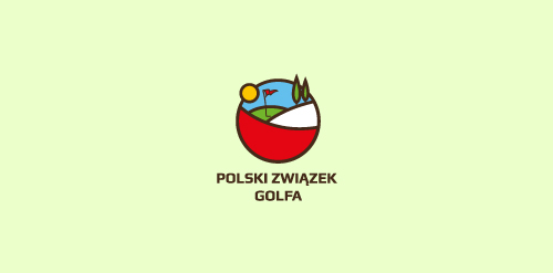
second concept for Polish Golf Union

A concept made for a dental studio - premium dental care.

another concept for a dutch company which installs solar panels.

a fast project - very economical - for a company, portal giving a functionality to give quck donations.

second concept made for the polish film commission - not used.