LogoMoose
  • Logo
    Galleries
    • Featured logos
    • Most rated logos
    • Most viewed logos
  • Identity
    Galleries
    • Featured identities
  • Packaging
    Galleries
    • Featured Packaging
  • Designers
  • Competition
  • Upload
  • Become Member
  • Login

  Most viewed logos – Page 67  

Cardiology

Cardiology logo

crni-sinComments6Jun-20-15
Star Record

alekchmuraComments1Jul-30-09
Bonjour!

Surfboards Bonjour!

pitcher-panComments1Jul-26-12
inklio

inklio - logo design. Based on custom typeface, K ink drop mark and print technology.

radekblaskaComments6Mar-25-15
Sophister

gravitartComments0Mar-08-10
Gel’s Kitchen

Gel's Kitchen logo

lboiComments12Aug-24-09Awarded
Design Bomb

Design Bomb (Graphic Design Studio)
http://dribbble.com/shots/1485572-Design-Bomb

pixelvisualizationComments0Apr-20-14
Five Graw.

Engraving shop.

midgarComments1Jun-02-16
Cyrillic vegan food logo

Cyrillic hand written letters are extending from leaf

masja98Comments0Sep-22-17
The Penguin Love

vasvariComments0Dec-06-10
Urban Gourmet

sean-heislerComments2Apr-01-10
Power to the Pencil

An idea that blossomed into a strong logomark

ocanadesignComments3Mar-18-11
Emigo

Emigo (from esp. amigo - friend) - electronics, mobile friend on the phone that allows you to manage of any area of ​​business. 7th version of the software.

mustang-marketingComments0Jun-14-13
alterdimensional

guestComments1Jan-11-10
Conneqt

.

almosh82Comments0Dec-03-17
Кекс (cake) in the city

bakery

yanamakarevichComments4Sep-24-12
Finch – motor technologies

Logo for Finch Motor Technologies - Car electronics in England

brandkingComments0Jul-17-16
Merce Hydro

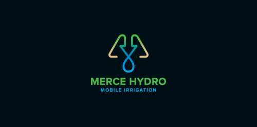
Merce Hydro, a mobile irrigation company based in Northern Victoria, Australia specialise in redevelopment of drought effected areas for the purpose of farming & residential properties. The Mark is based on the use of a water drop, an arrow, pipes & finished off with an M. The arrow symbolises function & the arrow/drop cross section symbolises design - both core factors in engineering & invention of their systems. Green represents growth, their aim. Brown represents destination (drought area) their market. Water represents sustainabilty, their long term plan, and finally the pipe represents management, their ongoing analysis & monitoring of their network.

hayesimageComments0Jun-16-12
CF

CF Monogram

cleberComments2Jan-12-16
codelab

Logo for codelab project (custom WP themes)

hordeComments0Oct-16-12
Foxography

Foxography

avetsComments2Apr-21-13
Terra Santa

Terra Santa Jardín Gastronómico

ruizemanuel87Comments0Jan-13-13
Skeeto

guestComments0Jan-05-10
American Red Kings

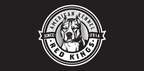
American Red Kings - They are breeders of American Staffordshire Terrier – (Amstaff) breed; sell puppies to Brazil and export to other countries. They also provide advice on breeding and animal behavior and expose their dogs at exhibitions.

milovanovicComments0Feb-25-15
Page 67 of 561«‹ Prev...656667686970...Next ›»

  About  

LogoMoose is an inspiration and design community that was launched in 2008. It showcases logos, identities and packaging submitted by professional designers, design studios or agencies. We showcase the best work from the best designers from around the globe. Become a member now and create your own portfolio!

Get your daily dose of inspiration to work on your own design projects and get your business moving. Be amazed by our logos, identities and packaging on this worldwide platform. We‘re here to inspire you and help you impress your clients and fellow designers. Get an overview of global trends in logos, identities and packaging. Browse our galleries and discover all the latest design trends.
We know you love your work!

© 2008 - 2026 LogoMoose.com - All logos are property of their respective owners.
FAQ - Privacy Policy - Imprint