Most viewed logos – Page 61


This is the logo for the transport company.

.

Miodowa is the name of the residential estate at Miodowa street in Wroclaw. Miodowa is an adjective used to describe something that tastes like honey. That is why we join 3 themes in the logo: honeycomb, architectural design and letter M.
Designer: Piotr Ploch

This logo was created for fun. Inspiration: fresh and pure mountain wellspring. Elements: water drops, letter "M" hiding behind the drops, three drops has a shape of mountain, white space between the drops looks like wellspring.


Clinic logo


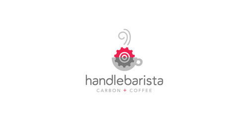
cafe


e-commerce website to sell lightweight bicycle frames, accessories and also accessories for skateboarders.

Unused proposal for an activity sport clothing manufacturer. Target audience: Motorcyclist, shipman, hunter, rider.

A logo mark involving a sloth and a pencil.
logo done just for fun


Self promotional logo created for a promotional mailer sent out in search for internships.


Sale of souvenir wares as small pictures or postals. Gift pictures are drawn from a hand. Pictures under an order.


Logo proposal for a food and drink concept company

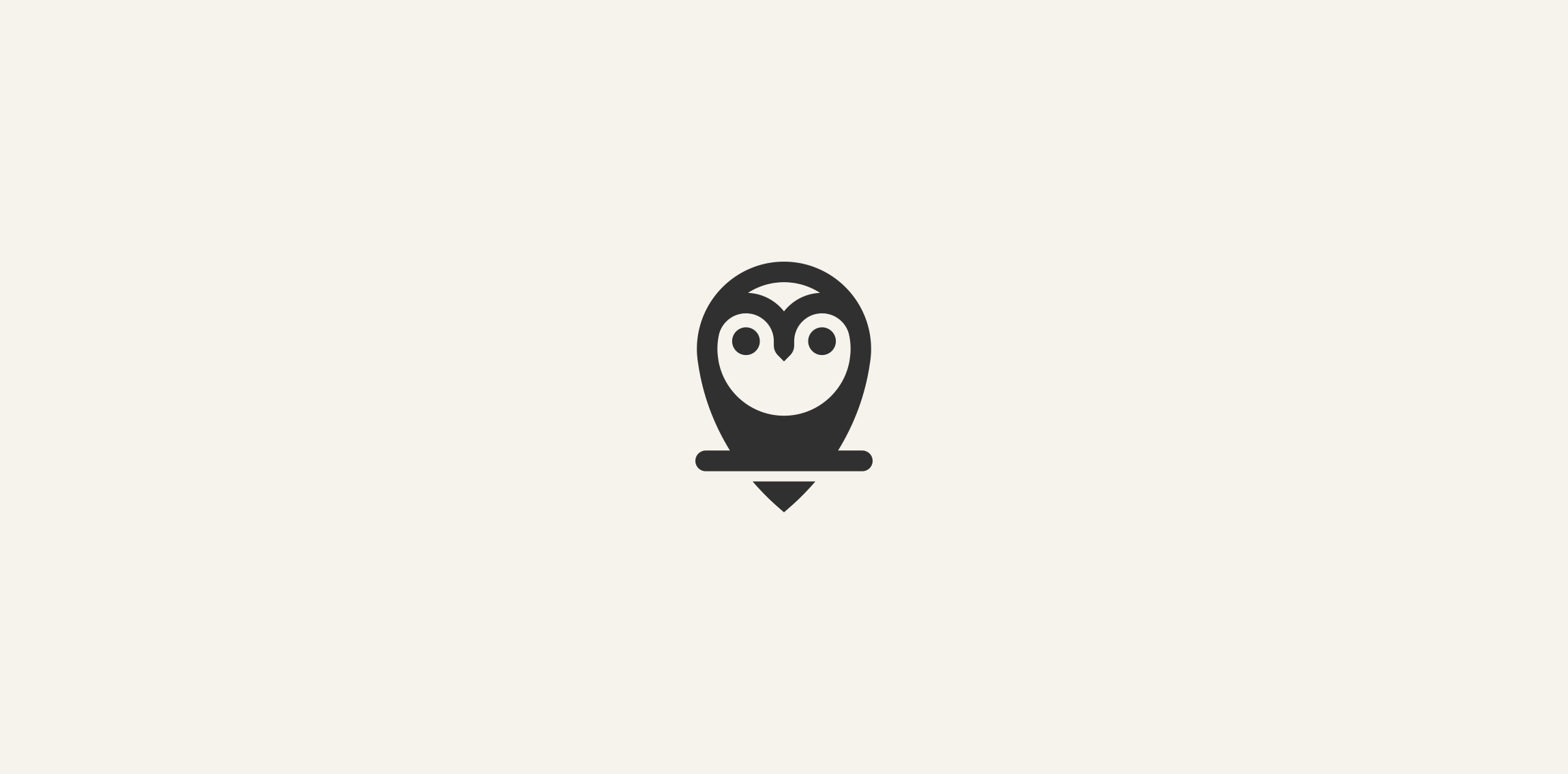
Owl logo just for fun. www.ashflint.com

For sale!