Most viewed logos – Page 502


Unwanted proposal for: Travel studio with a THEME-based Travel Experiences of a lifetime. These tours are niche escorted journeys around the world. The studio conduct Land journeys, Cruises, Package tours, Vacation travel, Education tours, etc. most of these tours are exploratory tours.

Logo for a company that shares the latest news on free giveaways and events in Vancouver, BC. Inspired by "gossip" or the "talk of the town", I incorporated two fun little characters in the type. :)

This logo was created for spicery producer for cook.

Logo for Pain Relief Clinic

They help people with computer problems.
Spread Your Business Anywhere
Kuttyoffers bring you frequent updates on the latest and finest offers ever seen before. We support the customer and trader to get more benefits. We really display a huge range of offers at superb discount prices. Kuttyoffers.com is your best way to explore the ads with big savings where you can trust. Our site is the main center to find all around offers at your city.
The concept illustrate that behind KWAN (K) are his ASSOCIATES (The shadow of K, A).
Designed by Leanie van Loggerenberg

logo created for a jeans brand based in mexico.
This logo can be used by many companies: corporate, entertainment, fashion, interior design, games, internet & web and many more.

Stylist is Pr but not like people

Healthy water

this logo was made for my website's launching party
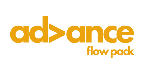
A clean, simple, straightforward logo for a flow packaging company's 2015 facelift. The simple rotation of the V symbolises the movement and process this company's machines operate with.
Plaster Mortar, Cement Based Adhesive & Wall Putty Manufacturing Company

Restaurant Logo


this is studio logo design

Eco, Landscapting, Campground

laevsky logo new
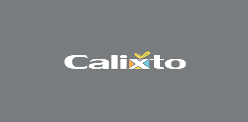
CALIXTO is fresh modern dynamic brand with short easy memorable name. It will suite well to any business or industry.

'Subji' in Hindi means vegetables. Subjiwala is a Bangalore based service that offers home delivery of fresh fruits and vegetables. The messaging of the brand was centered around the idea of 'freshness' and a graphical approach was used to convey the same, as opposed to using the generic photography route.