Most viewed logos – Page 492

logo CSA


Nano Flame logo
Graphic identity for the Oslo based musical group Midi Mantra. Focusing on the word such as Midi Mantra was the starting point of a good idea; we combined these two words to be a creative outcome with a clear visual language and a strong logo signature and a style that follows a certain set of strength and clarity to organize the creative outcome. To top it all we created a visual language that will help the logo/name of the band to come out clearly and communicate the right associations the band want to convey in their visual and musical language. Hoping to leave a massive impression when visual language is carried out amongst other posters on a poster bulletin board.


packaging co.

a capella band in switzerland

The milk will deliver within 24 hours from farm to bottom. fresh and health.
Mobile application logo : enjoy exclusive benefits in Saint-Tropez !
Logo for minifootball team FK SelfSpike.

Logo for an audio software company


Logo for Singapore’s online local humor channel - www.funnymeh.sg The face is formed from letters X & D, which when typed together (XD) form the emoticon for ' really funny ' or ' :D times X '

Ресторан европейской кухни
Logo for movies studio bulbfield.


Idea Sight

Logo concept for a restaurant

Logo for the company that produces multi-colored box.

Solo is the margarine brand from Unilever in Belgium. This logo is used for their website with recipes.
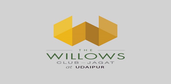
A brand of premium Club Resorts was planned by the Ishaan group, which was a hospitality concept new to the country. The business model under which the brand operates is a management model. The various club resorts across the country are to be launched and managed by premier hospitality groups. The first club resort in Udaipur was launched under the aegis of TajVivanta. With this club-resort, we wanted to signify the quintessential luxury and exclusivity quotient of the brand.
What we did
The name Willows was chosen out of over a 100 others due to it’s key associations with ‘Green’, ‘Woody’ ‘Gentlemen’s sport’. The identity is inspired from the architecture – straight lines, slants and intersections. This visual identity was established and then succesfully carried forward in the launch communication.


Logo design for an amazingly talented stone masonry company.

JAMMBOREE - E-commerce Web Site - Logo and Stationery https://www.behance.net/wip/733985/1347547
